

Dwaalzin
EN DeMens.nu (translated: TheHuman.now ) is a humanistic non-profit organization that recently started a youth program. The objective? To build a new sub-brand where the youth department can thrive on its own.
The client requested a brand name that would stand out, have a ring to it, and leave people wondering. Out of several concepts, colleagues Ken and Robin L&T settled on the name

The logo incorporates the same pixelated characteristic found throughout the visual system. It emphasizes the digital environment in which a lot of youth activities occur, with a nod to more retro-digi vibes.


The parent brand’s logo contained flames — a reference to the torch — a symbol of the freethinking humanists. For the youth brand, we took that flame and shook it around, again in a pixelated way. There’s subtle symbolism at play here: the youths are using the tools of the older generation, but they are rebelliously shaking things up.
It made sense to continue along the line of the flame and incorporate the matchstick — quite literally a ‘baby torch’ — that similarly connects Dwaalzin to its parent brand. As a progressive movement, the youths are the match that lights the fire of change.

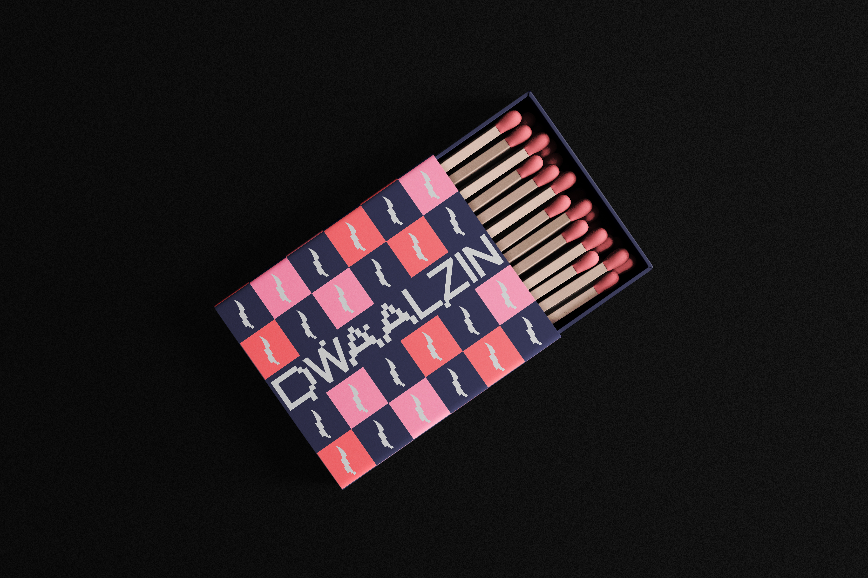


The client’s brief regarding colors was quite intriguing: “you can use colors as long as it doesn’t look like something ‘made by adults for kids’”. That being said, I used bright colors that don’t look poppy but rather convey a punk attitude and reinforce the youthful desire for revolution.


