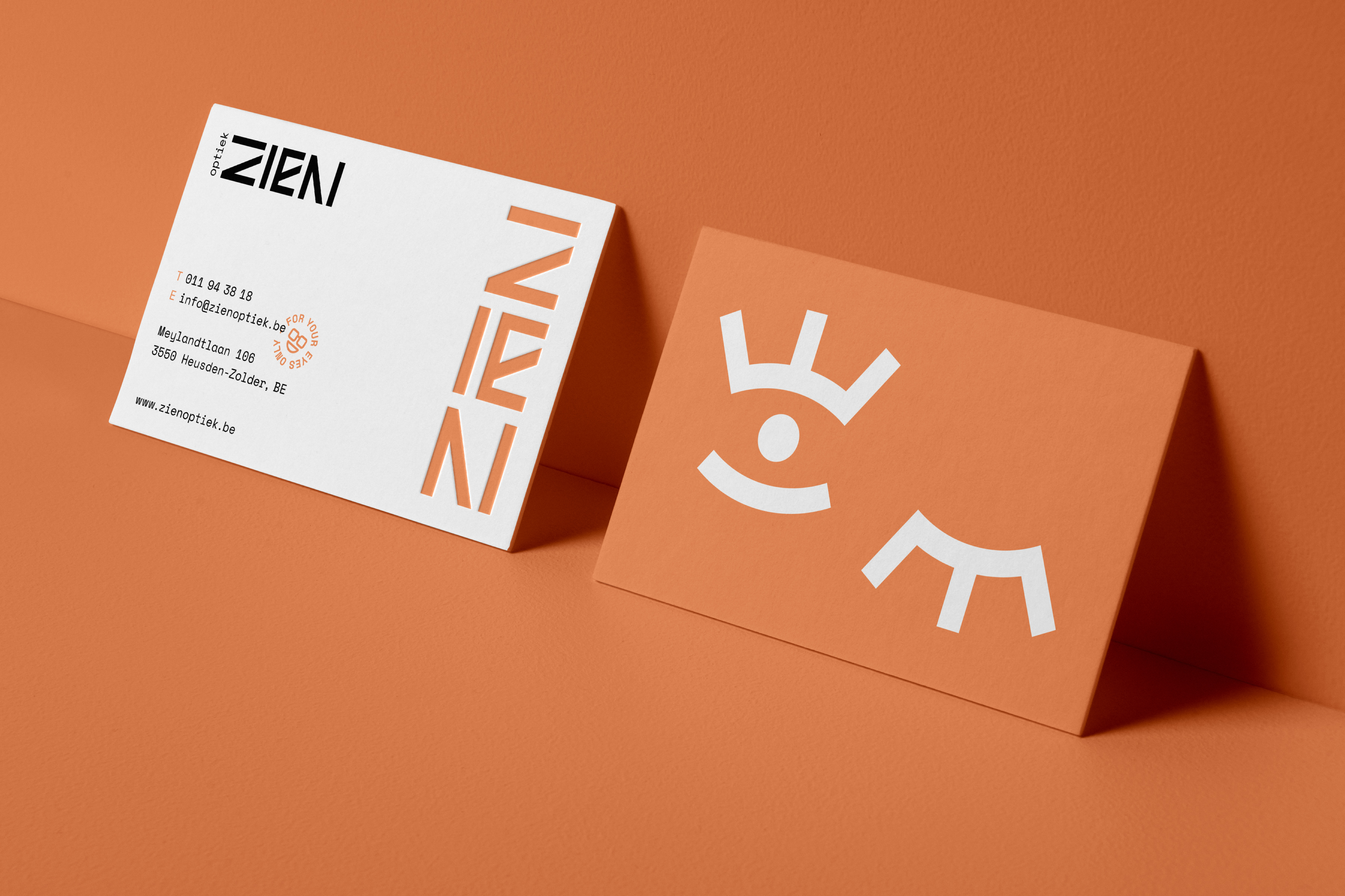
Optiek ZIEN
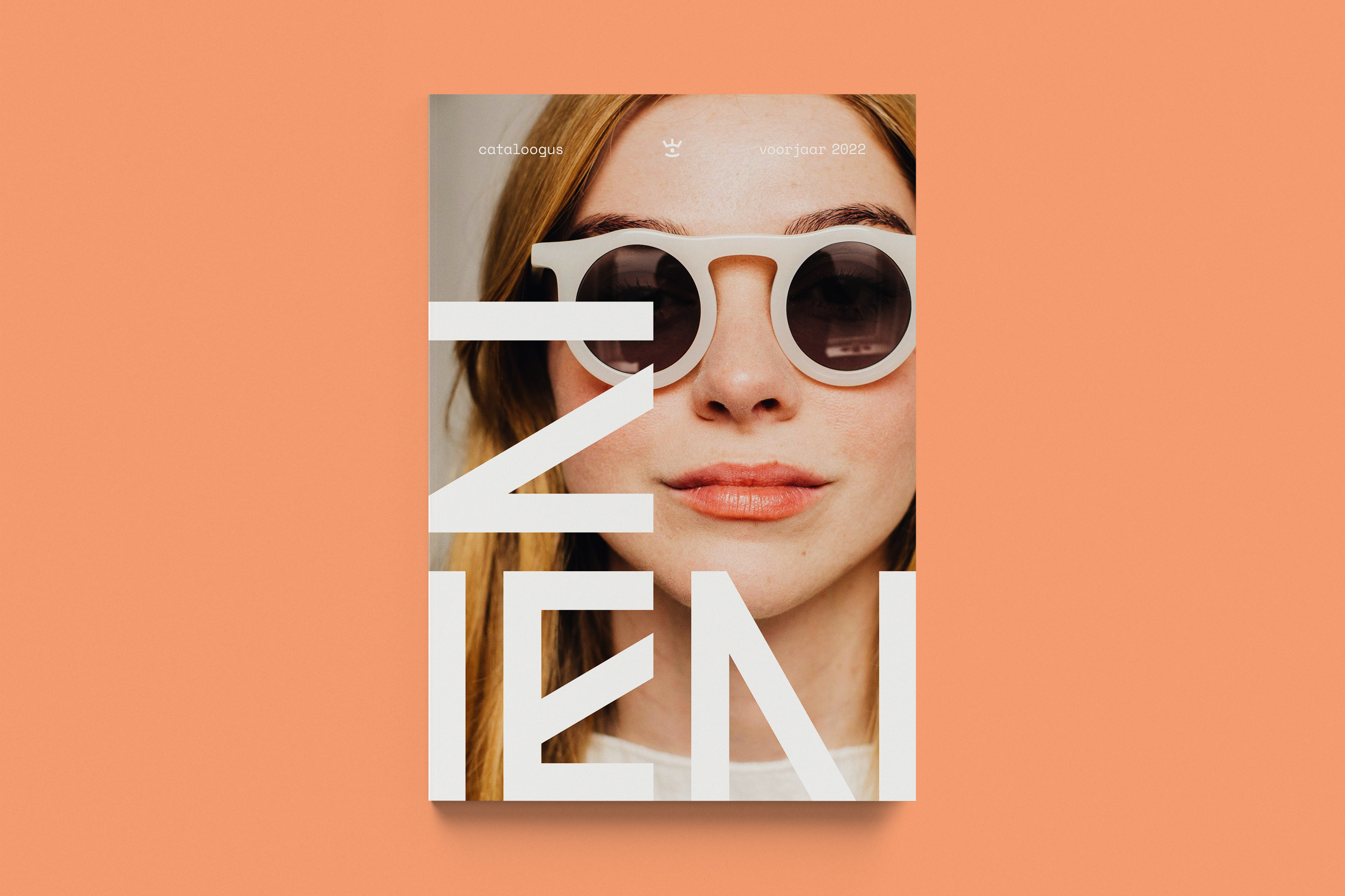
EN Lien is a young entrepreneur who’s obsessed with everything glasses. After working in the eyewear industry for several years she decided to set up her own shop, combining her skills as an optometrist and her love for designer glasses. And so ZIEN was born. — ‘Zien’ is Dutch for seeing.
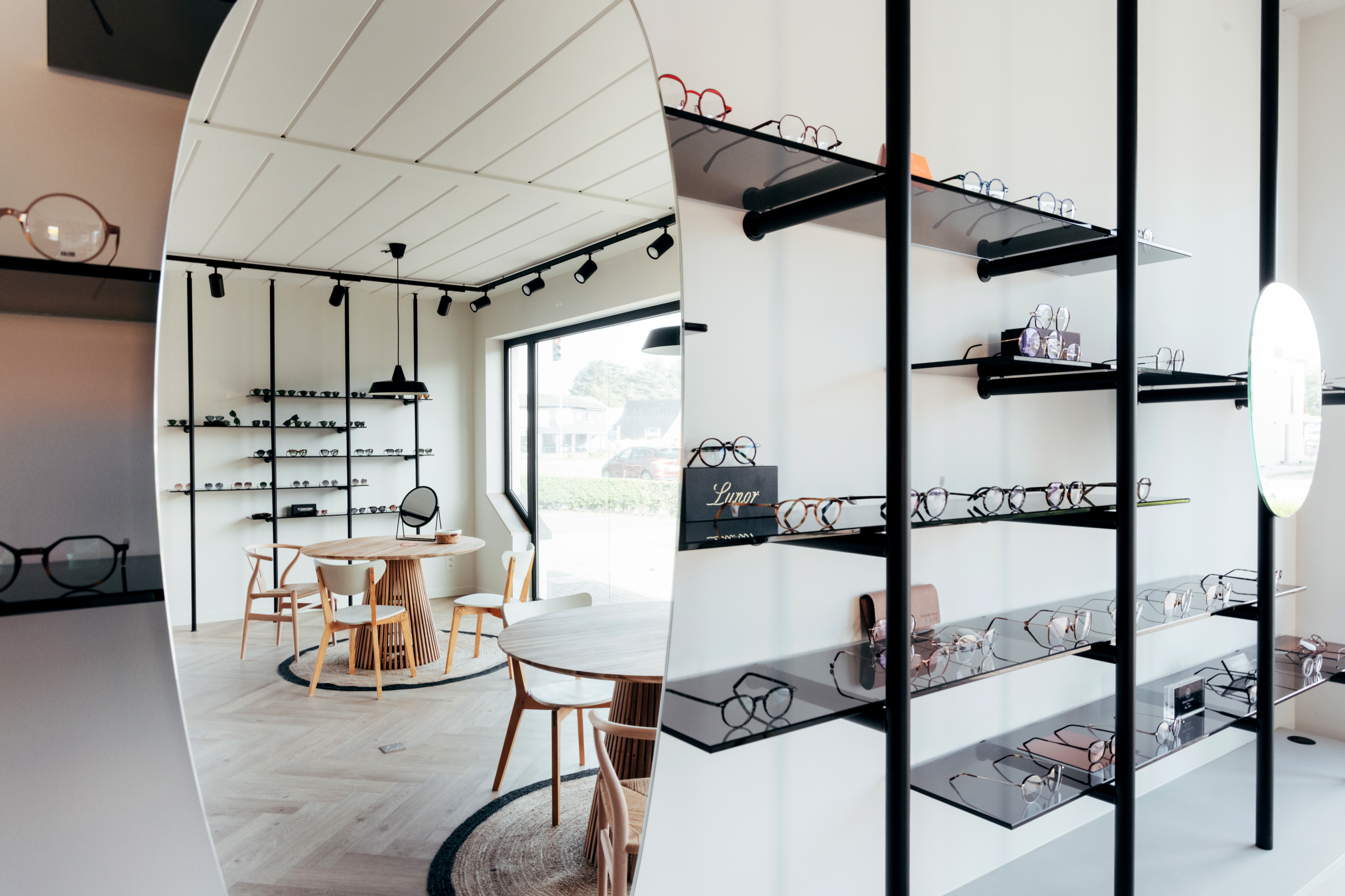
ZIEN offers exclusive — sometimes obscure and innovative — eyewear brands in a cozy retail shop in Lien’s old hometown. ZIEN’s brand appearance needed to do two things: appeal to the designer glasses connoisseur without scaring away locals. So we sought out to create ‘balance without blandness’.
ZIEN offers exclusive — sometimes obscure and innovative — eyewear brands in a cozy retail shop in Lien’s old hometown. ZIEN’s brand appearance needed to do two things: appeal to the designer glasses connoisseur without scaring away locals. So we sought out to create ‘balance without blandness’.
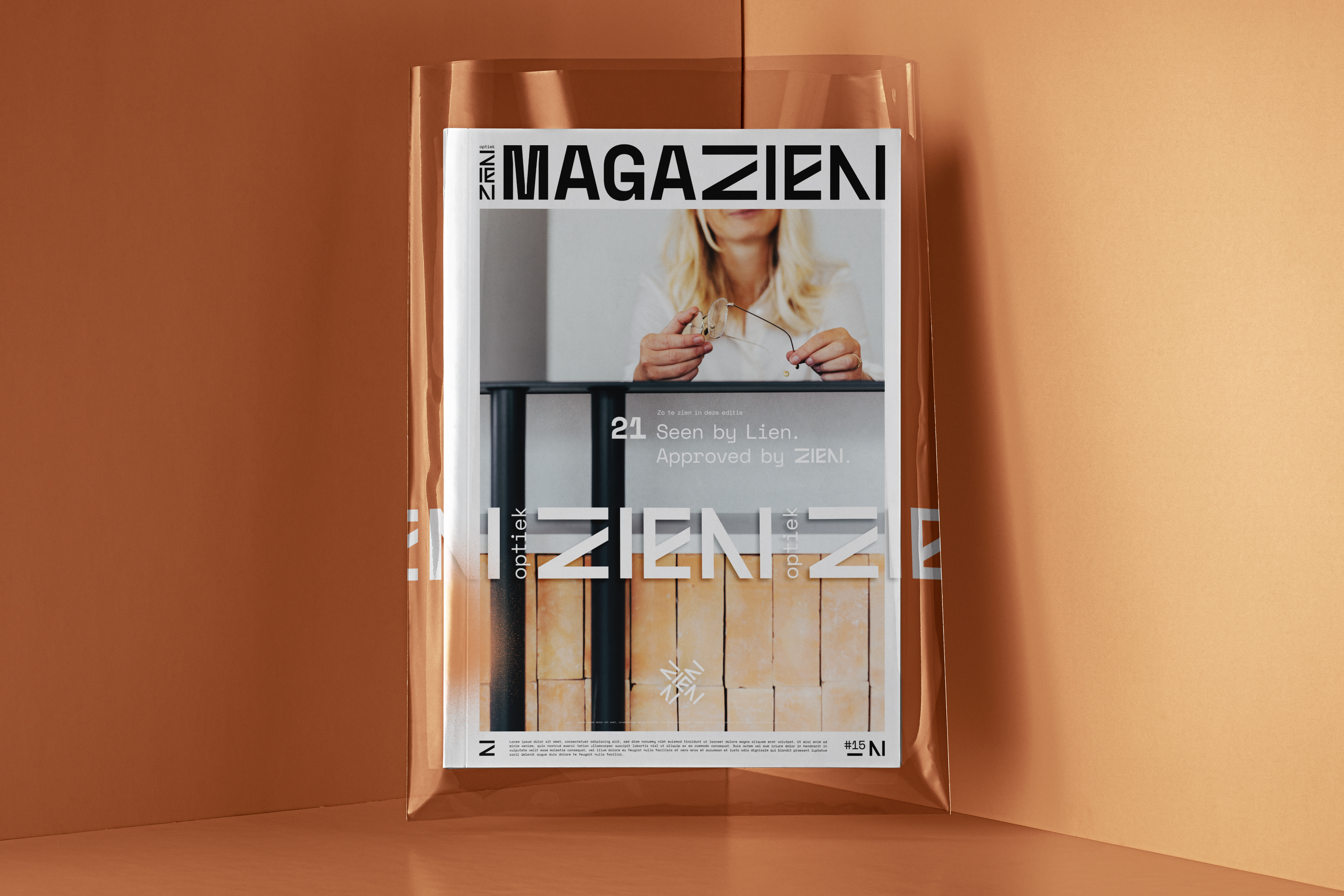
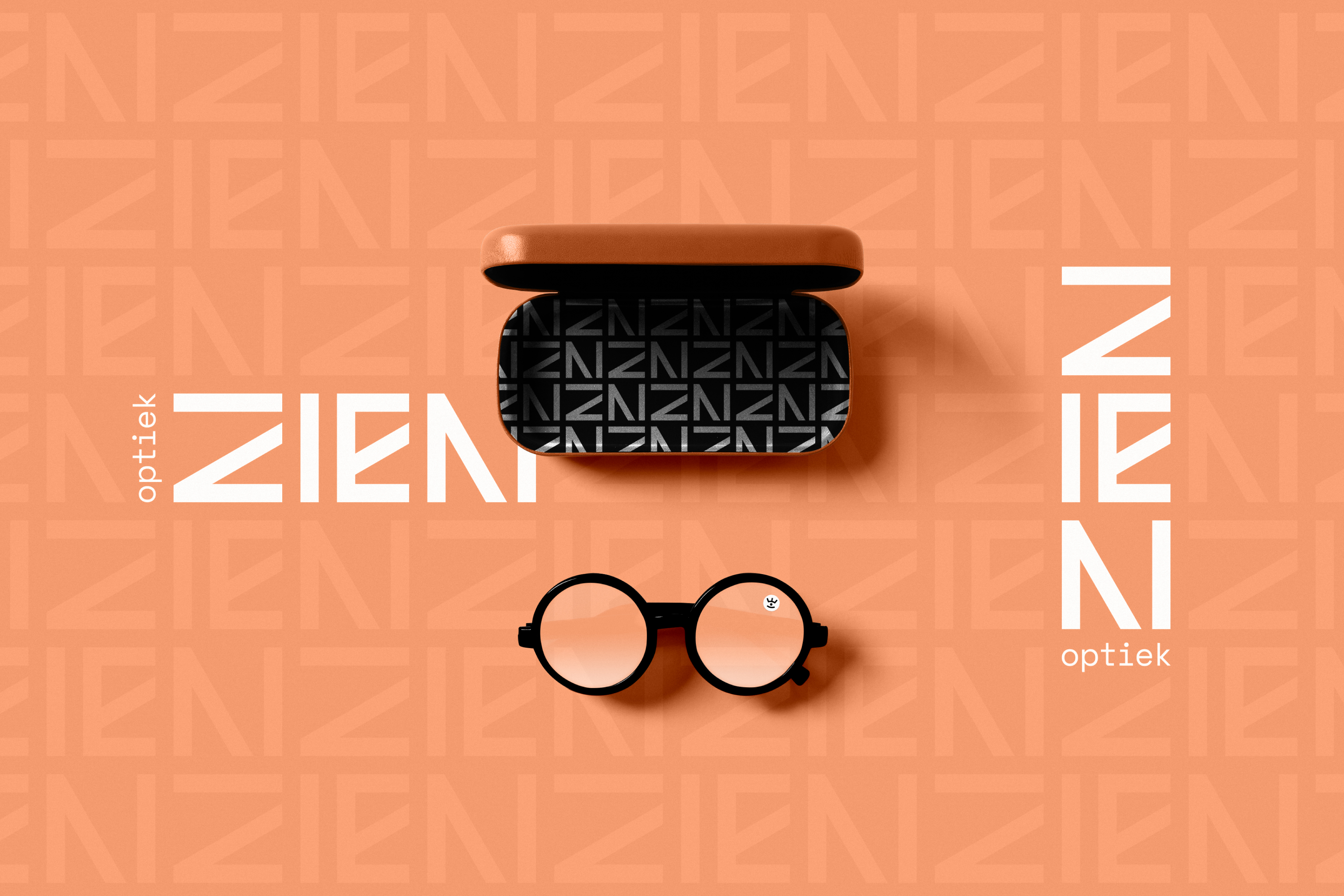
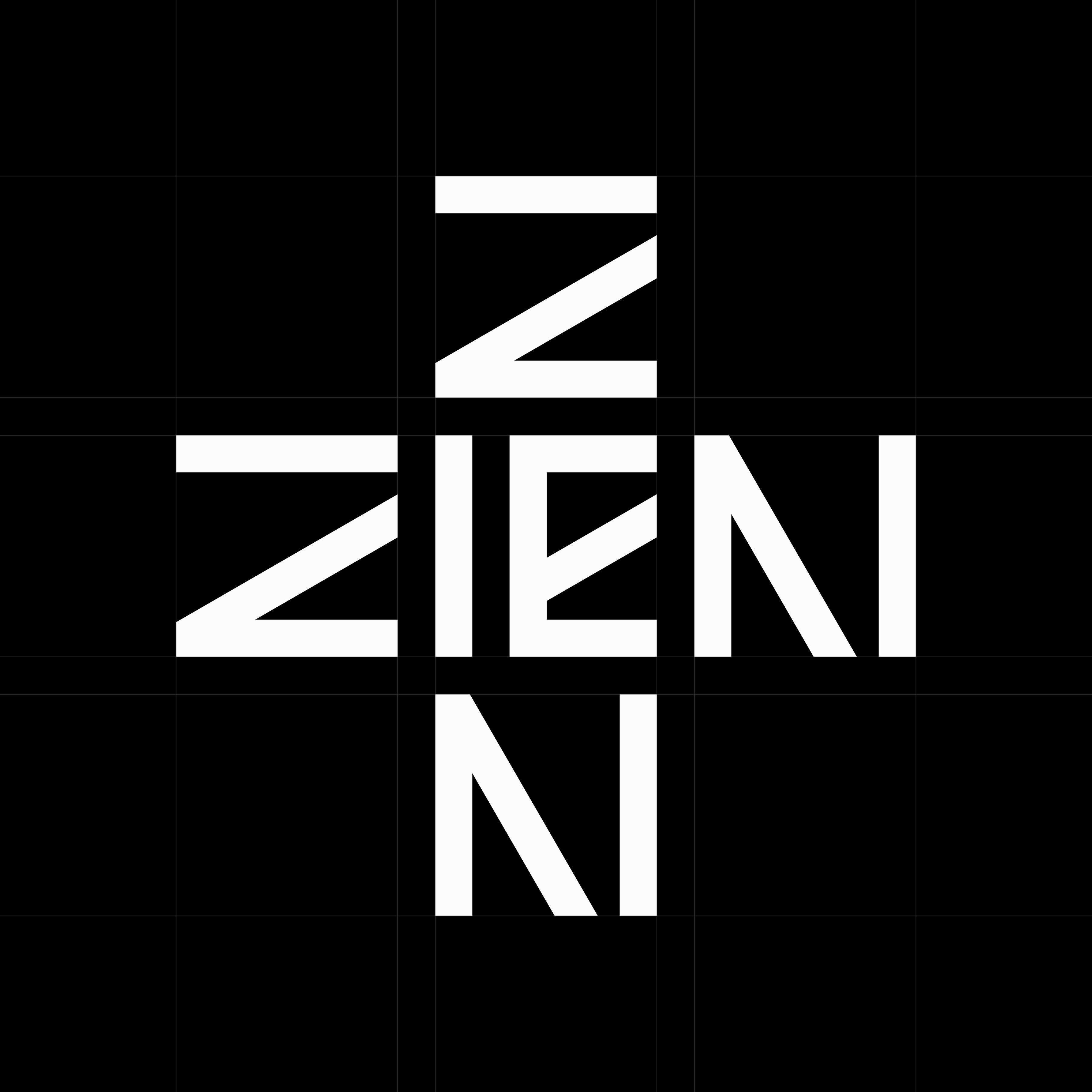
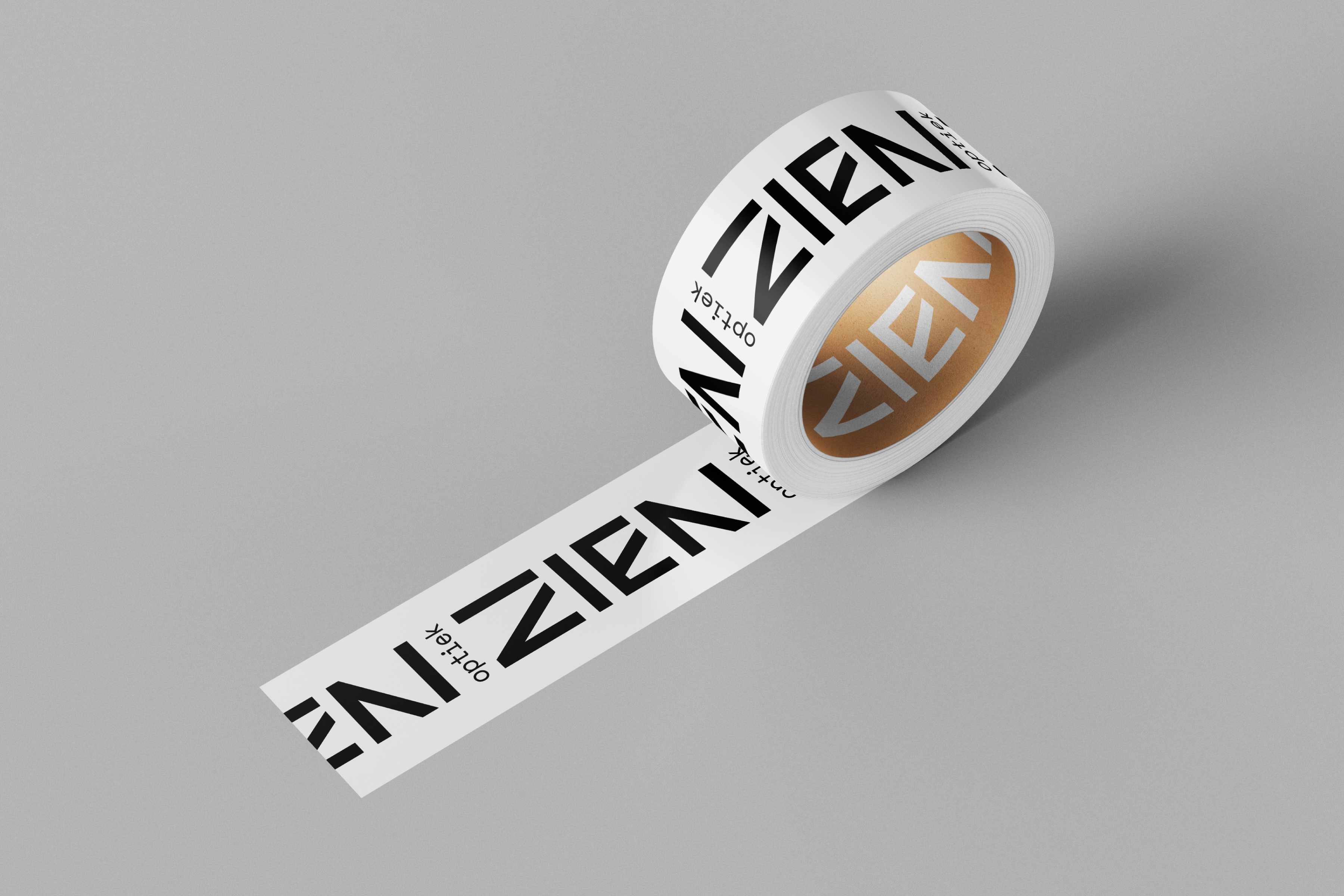
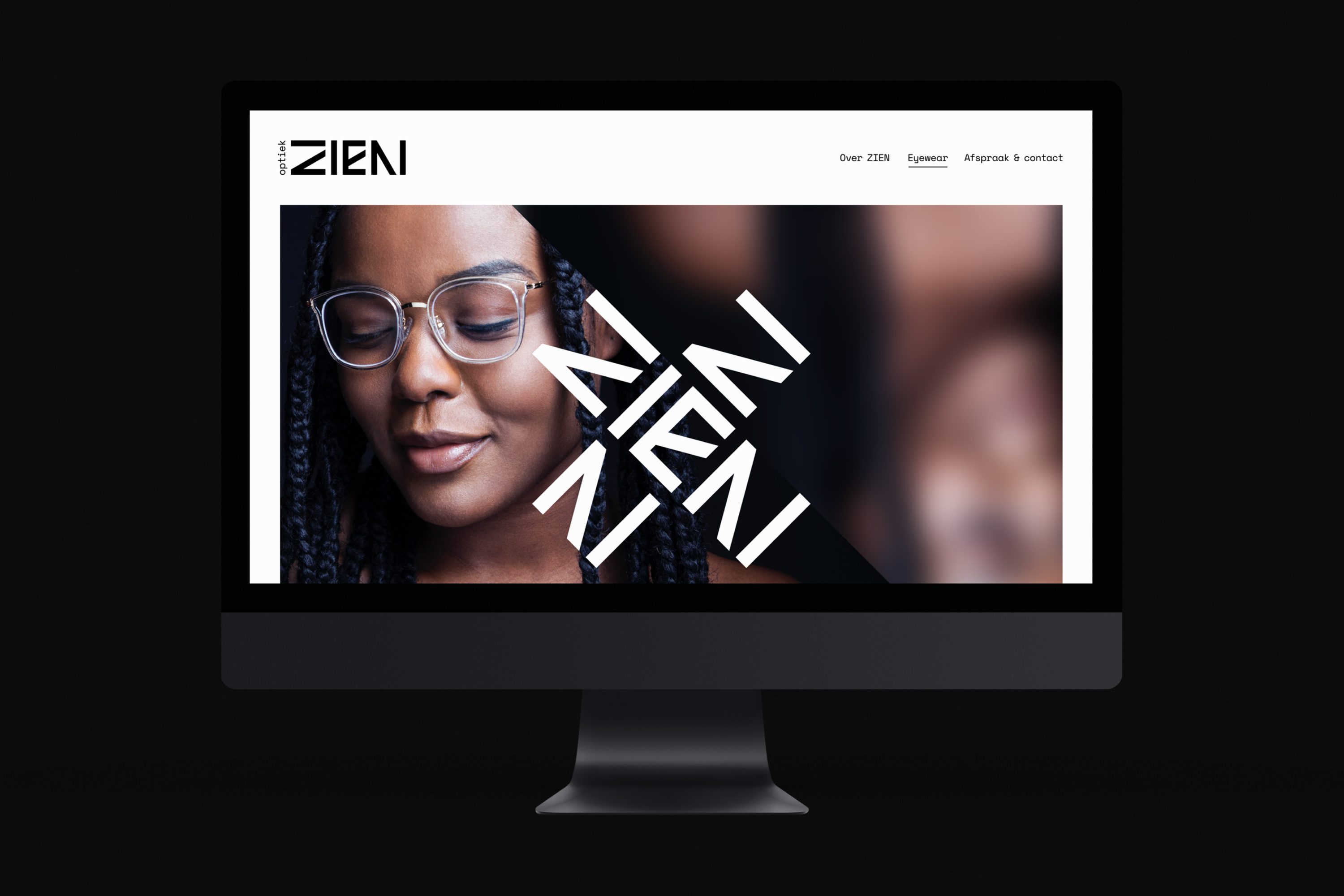
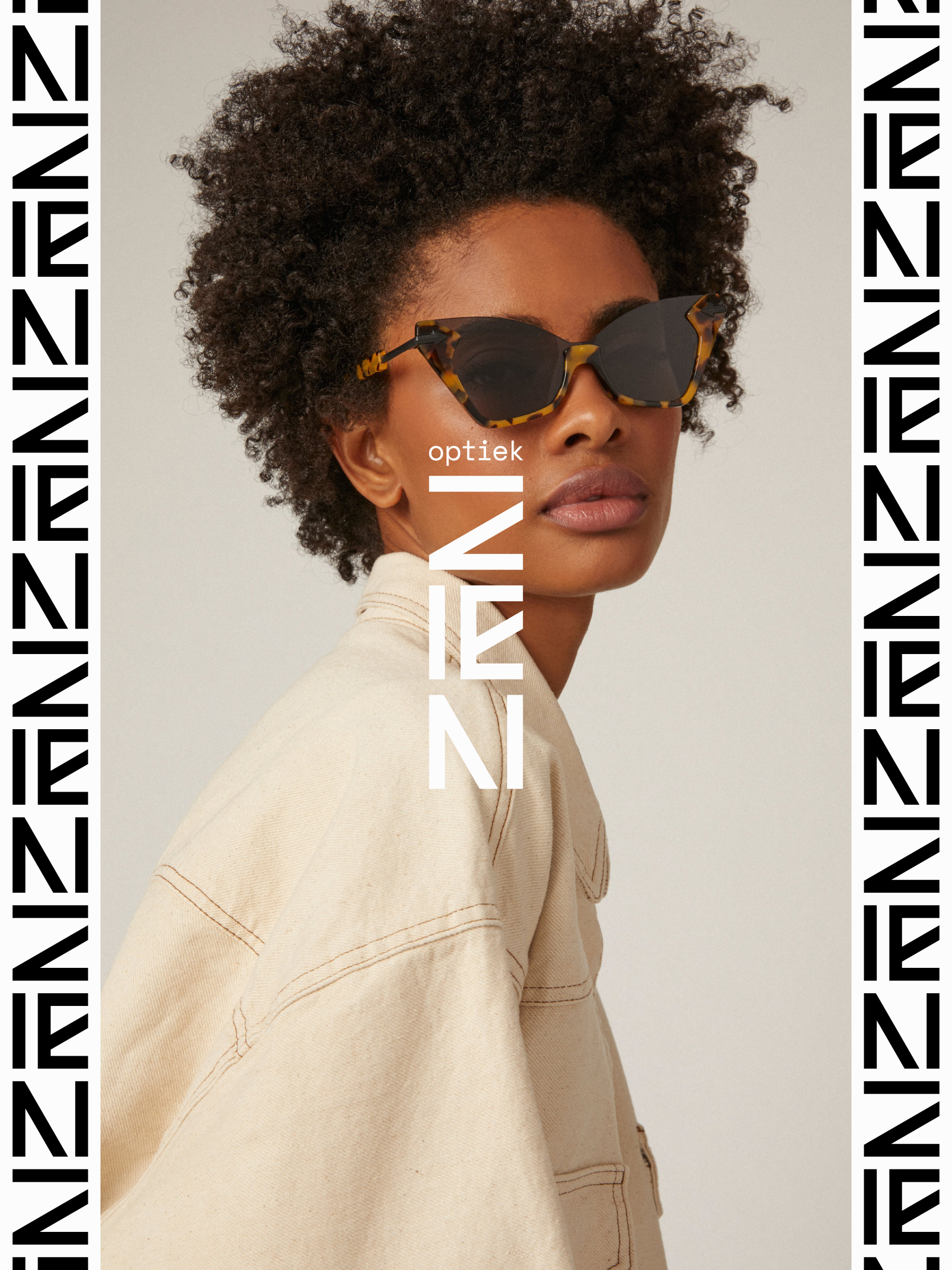
The stylish typography and tight lock-up are perfect for accompanying the designer glasses on offer. The square shapes hint at eye tests typically associated with optometry. Minimal yet playful, balanced without blandness.


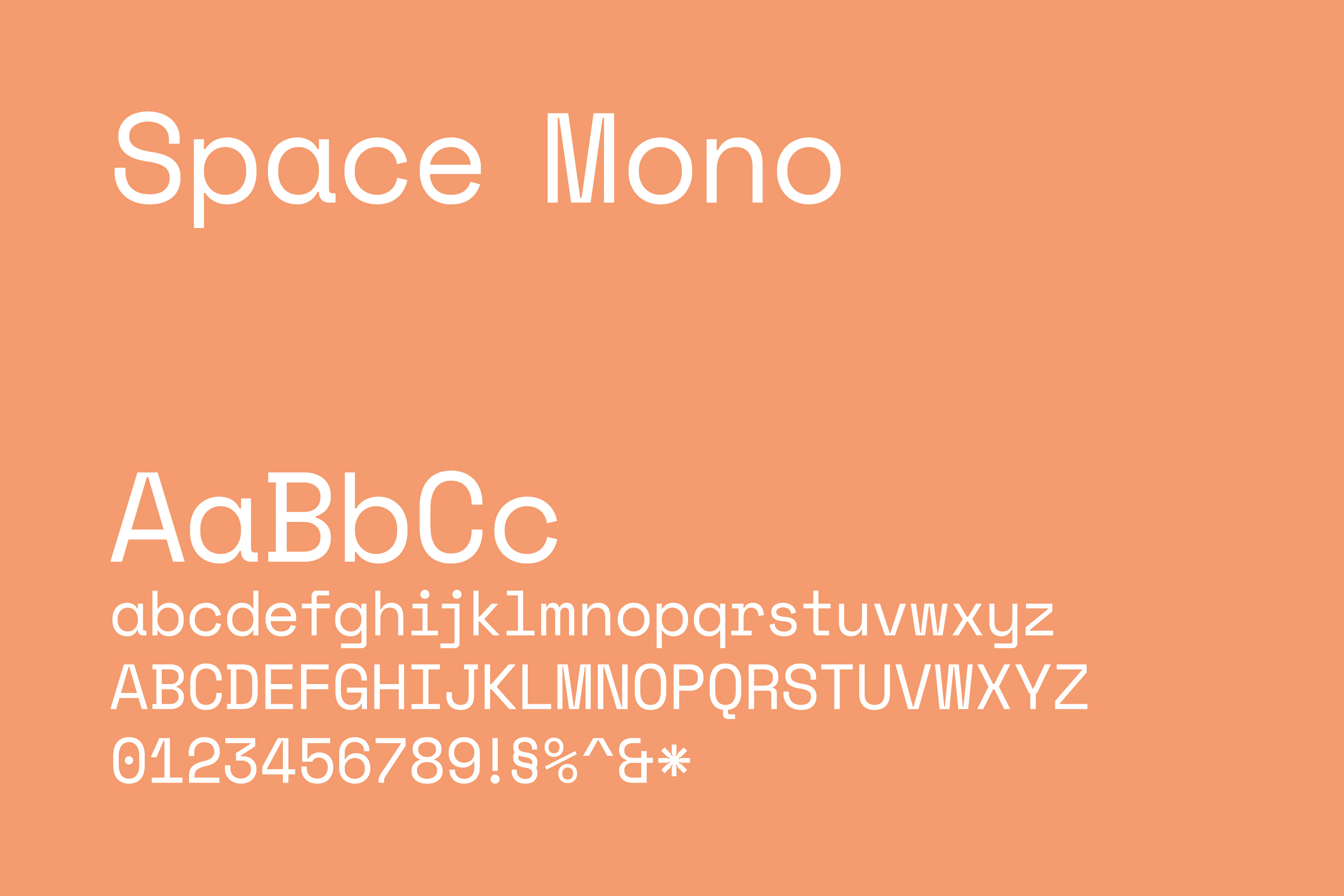
Opting for a single typeface keeps things looking clean and consistent with the visual identity.

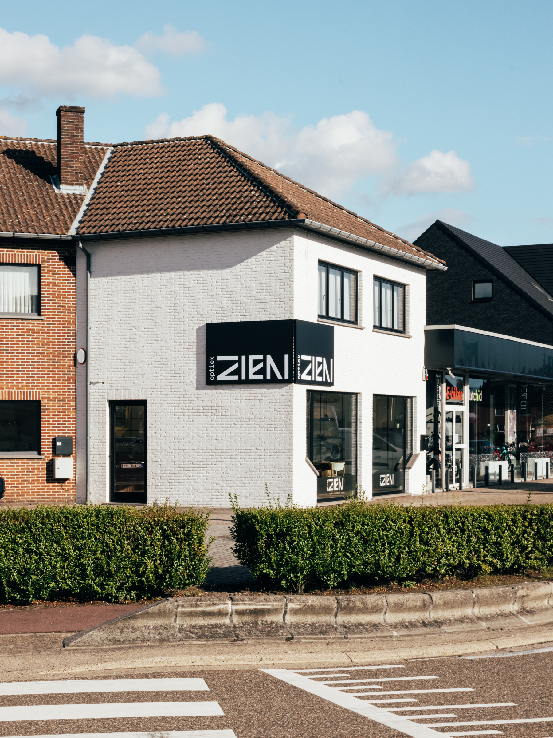
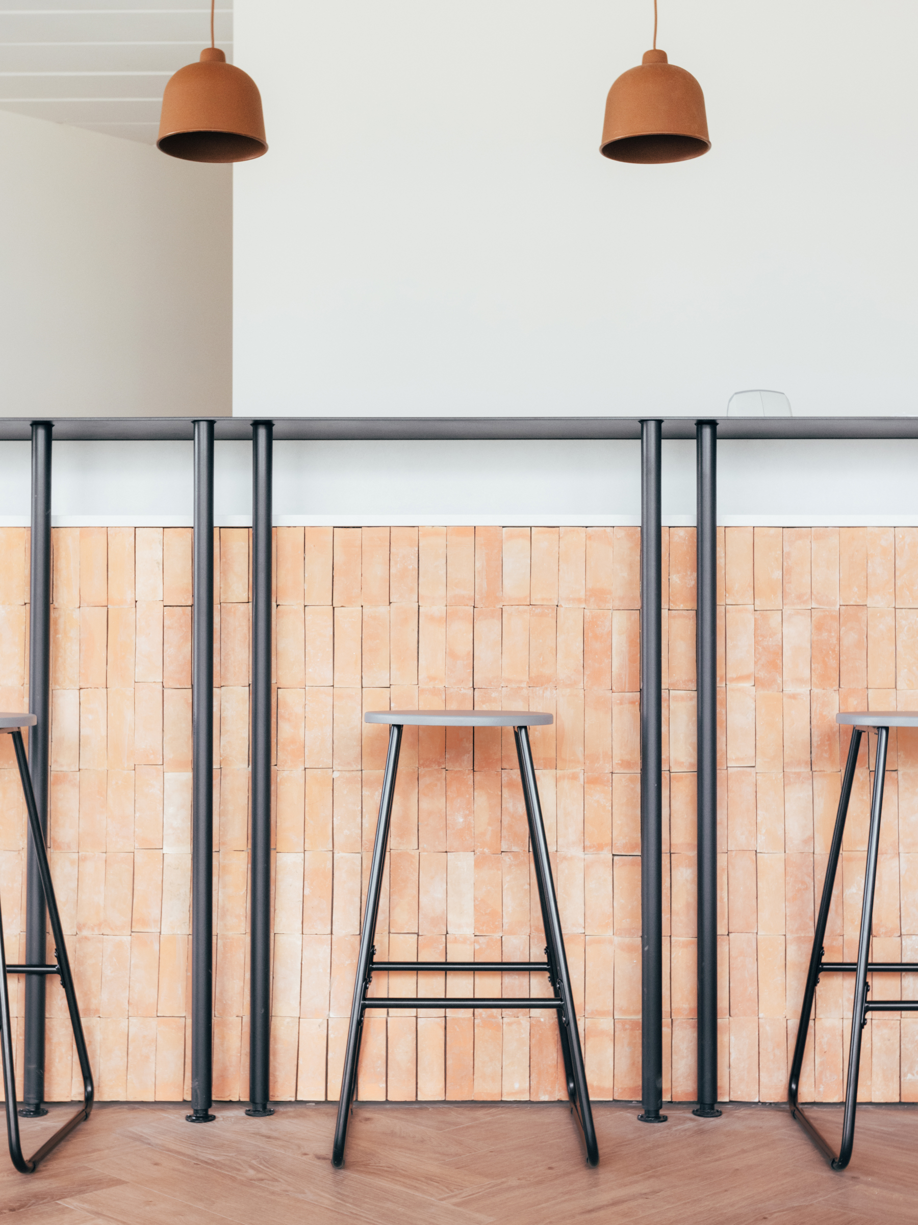
ZIEN’s brand identity doesn’t exist in a vacuum – it’s a real place! That’s why it made sense to use a warm clay color — found throughout the shop’s interior — as a foundation.


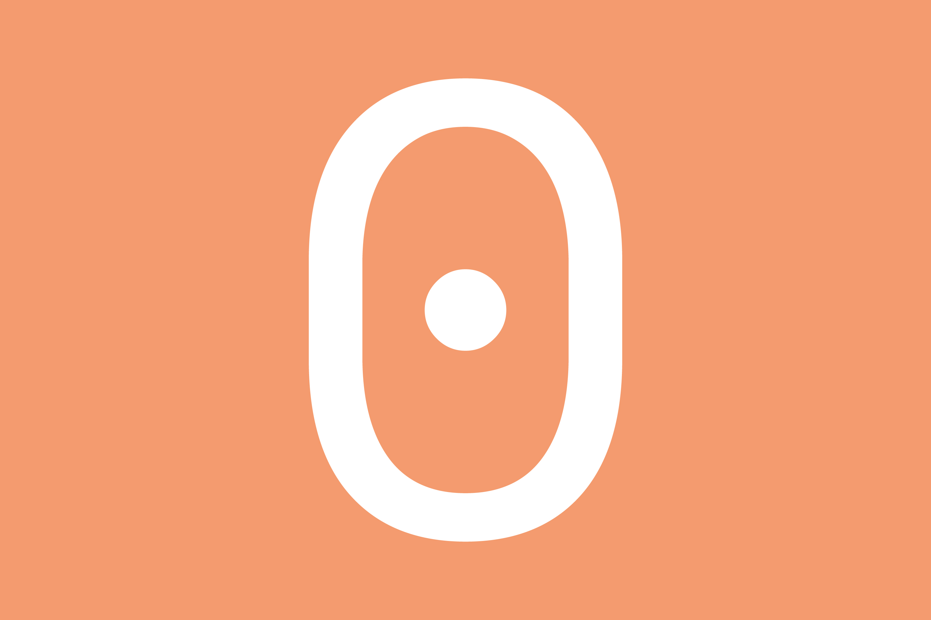
Additionally, we designed an icon suitable for many modern applications where a square or round format is necessary. Simple, relevant, distinctive and recognizable on any scale.