SAAMO
EN The branding process for non-profit often differs from commercial enterprises. This was also the case for SAAMO – previously known as Samenlevingsopbouw . SAAMO is a conglomerate of many community development centers. As such, we had a manifold of people chime in on the process, each with their own ideas. Quite a challenge!

SAAMO ran into issues with their name ‘Samenlevingsopbouw’ as a long and complex word. Moreover, their name was just an explanation of what they offered. Among dozens of names, the team settled on ‘SAAMO’ – a simple composition of parts of ‘Samenlevingsopbouw’. But now turned into a catchy, abstract and memorable name.

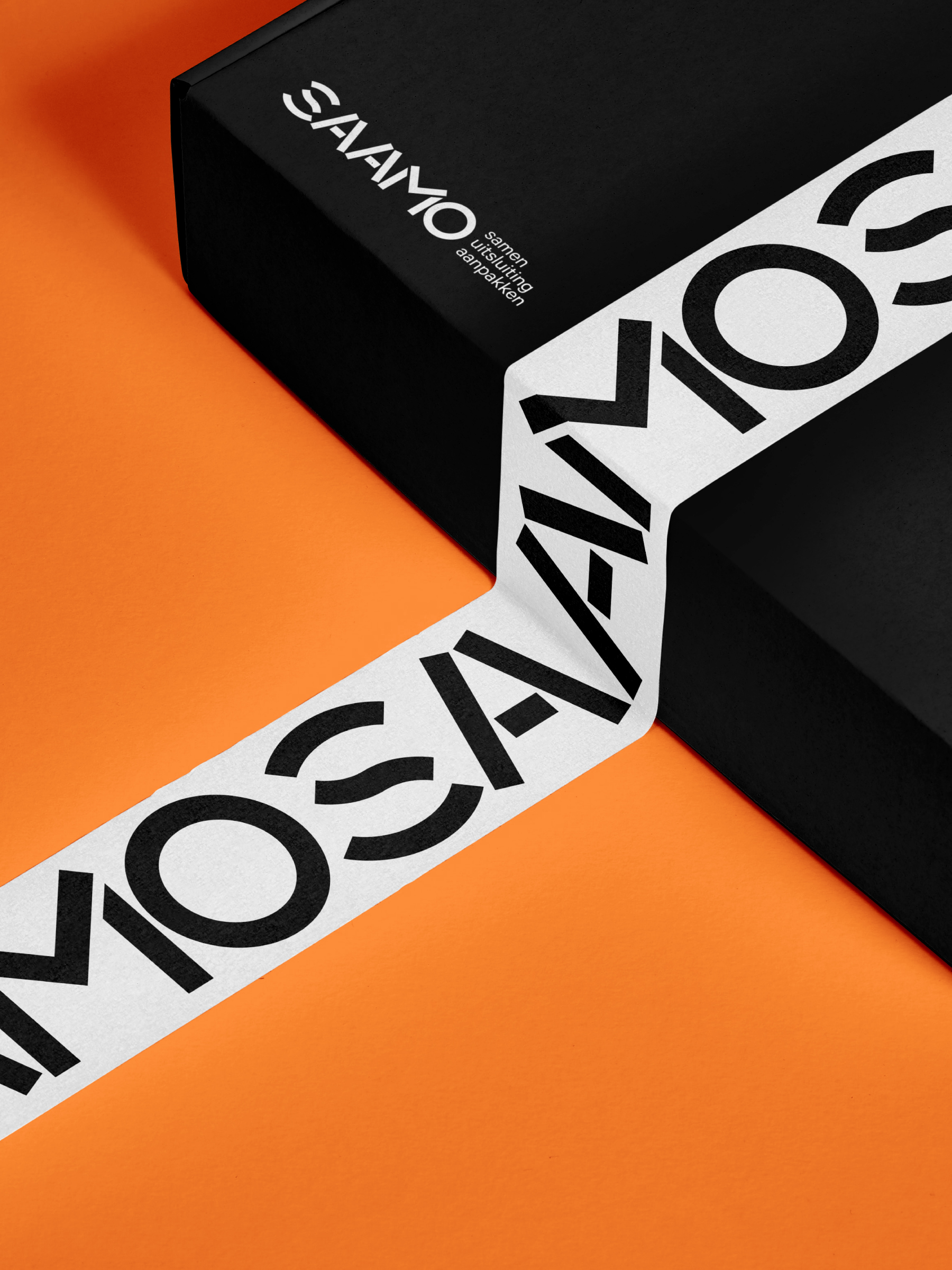
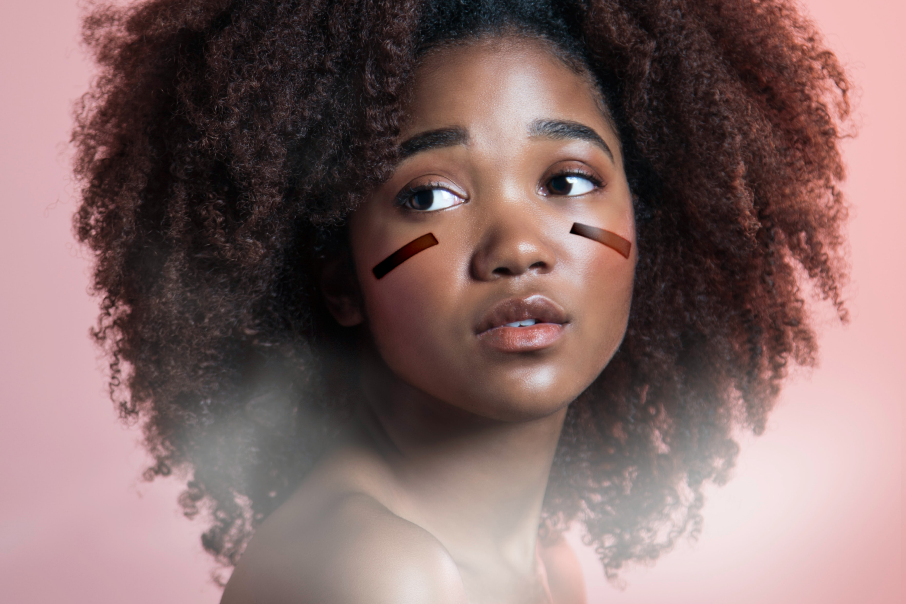
SAAMO, although catchy, perhaps sounded a little gentle. We balanced this out by adding a dose of toughness, leading to designing a tougher ‘brave warrior’ concept.
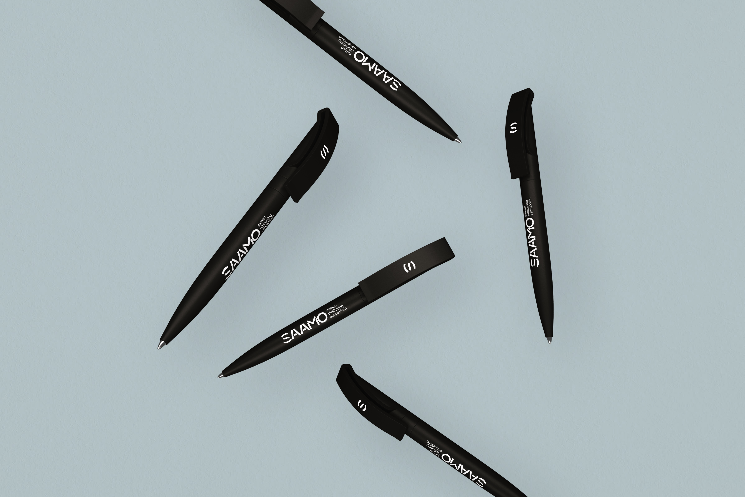
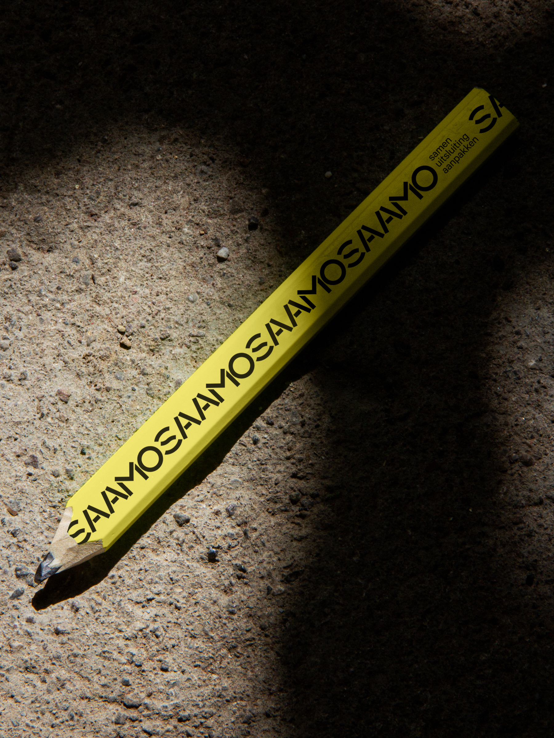
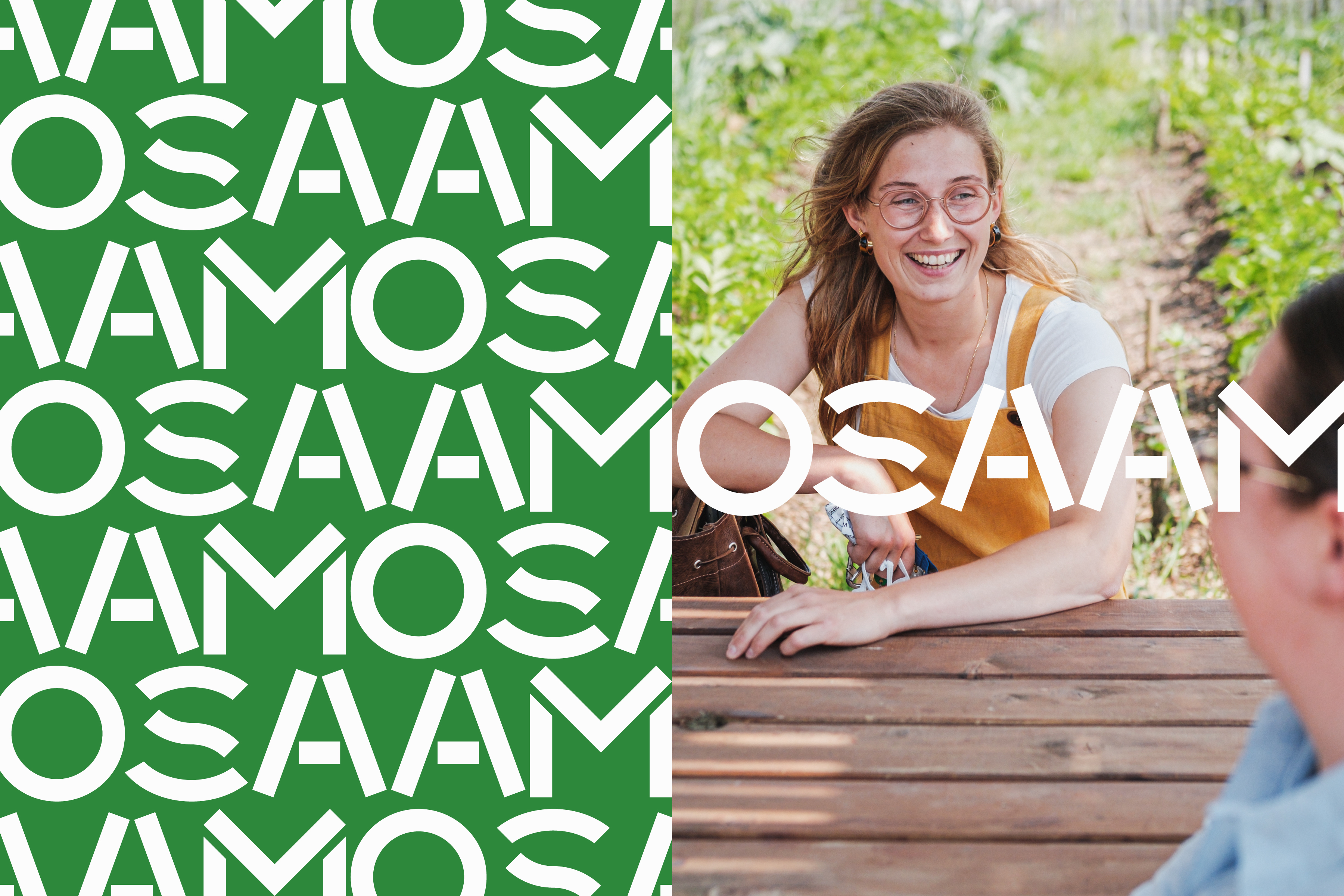
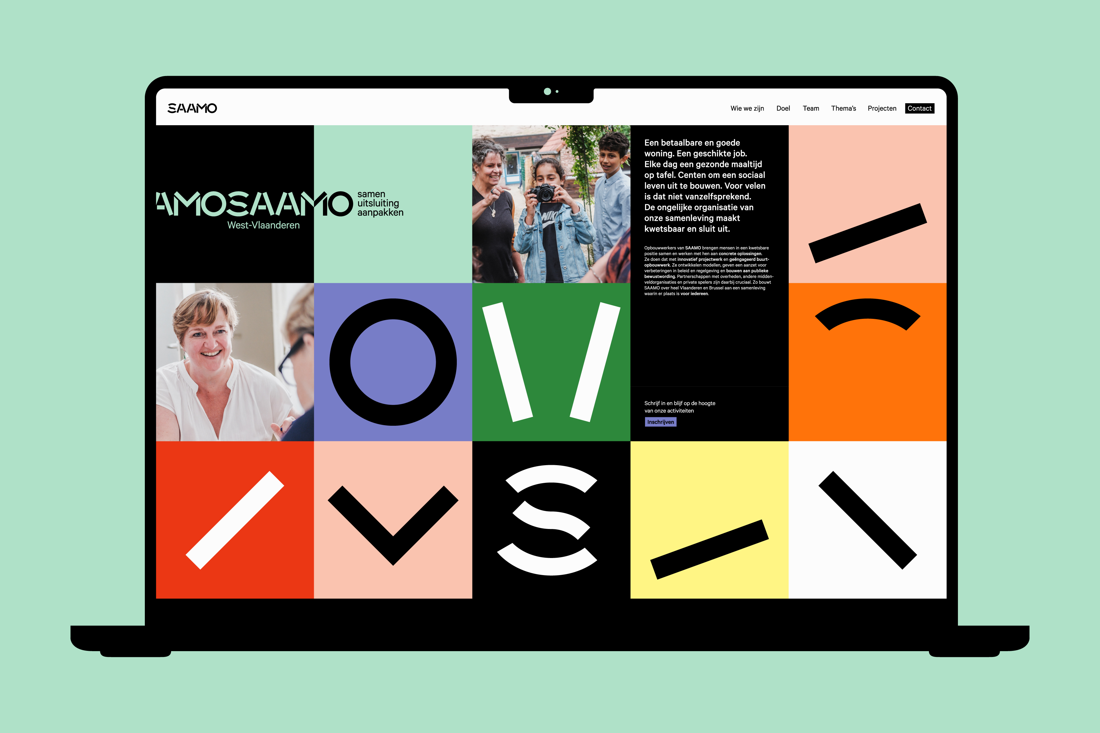
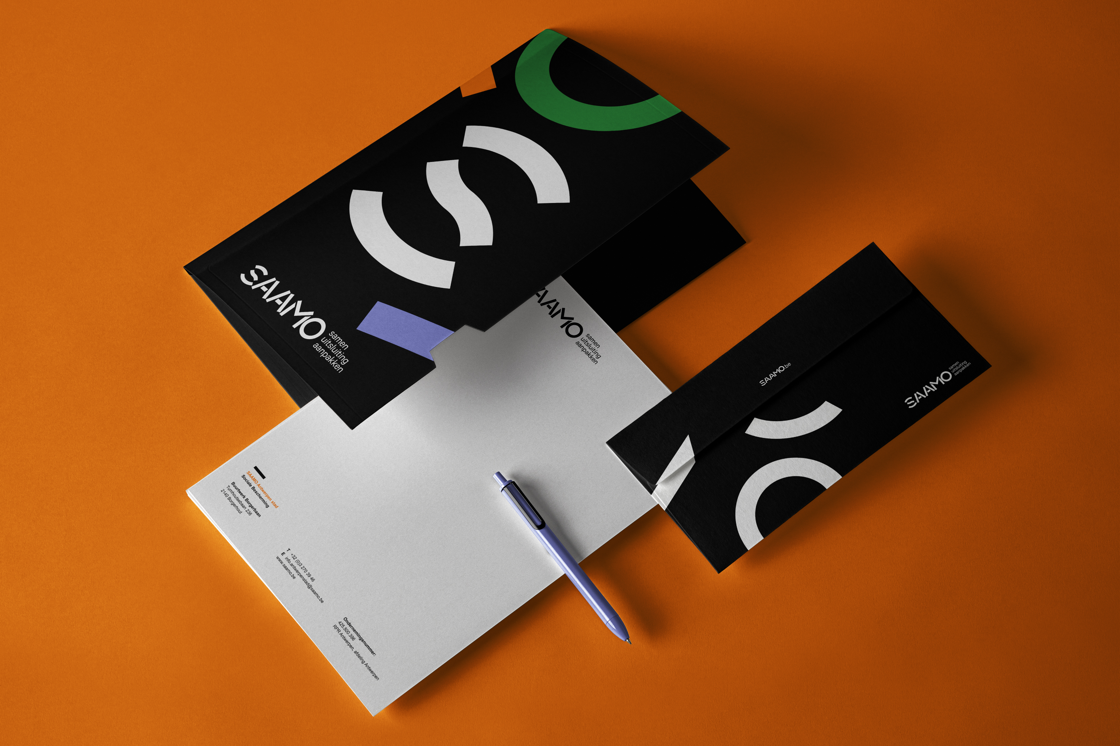
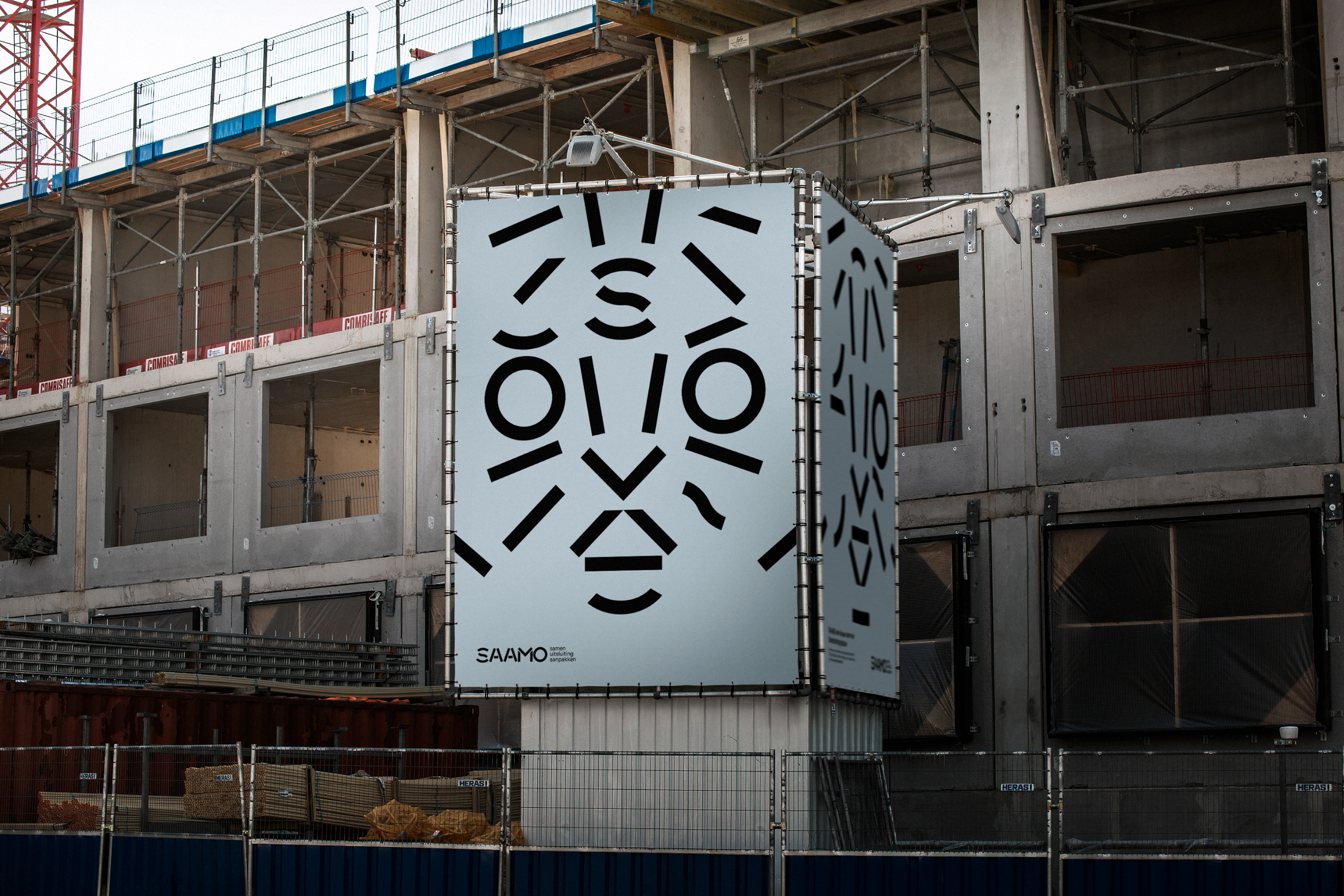
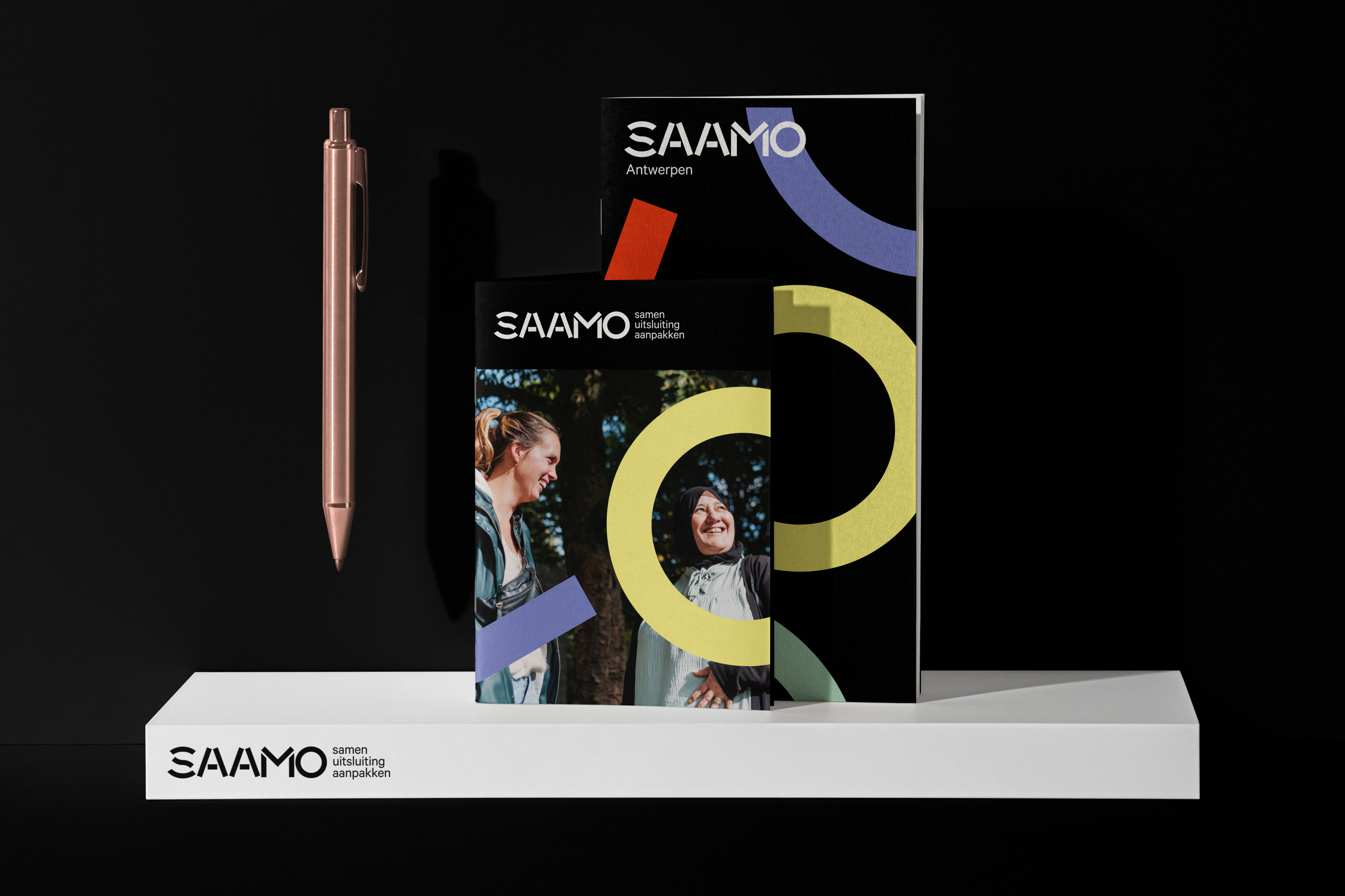
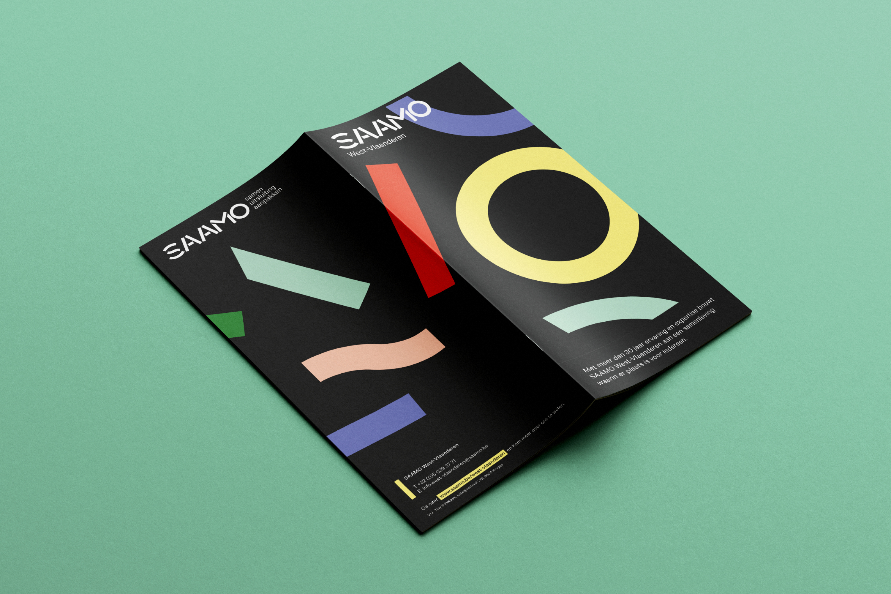
- The wordmark is literally constructed with separate building blocks, resulting in a logo boasting a powerful look.
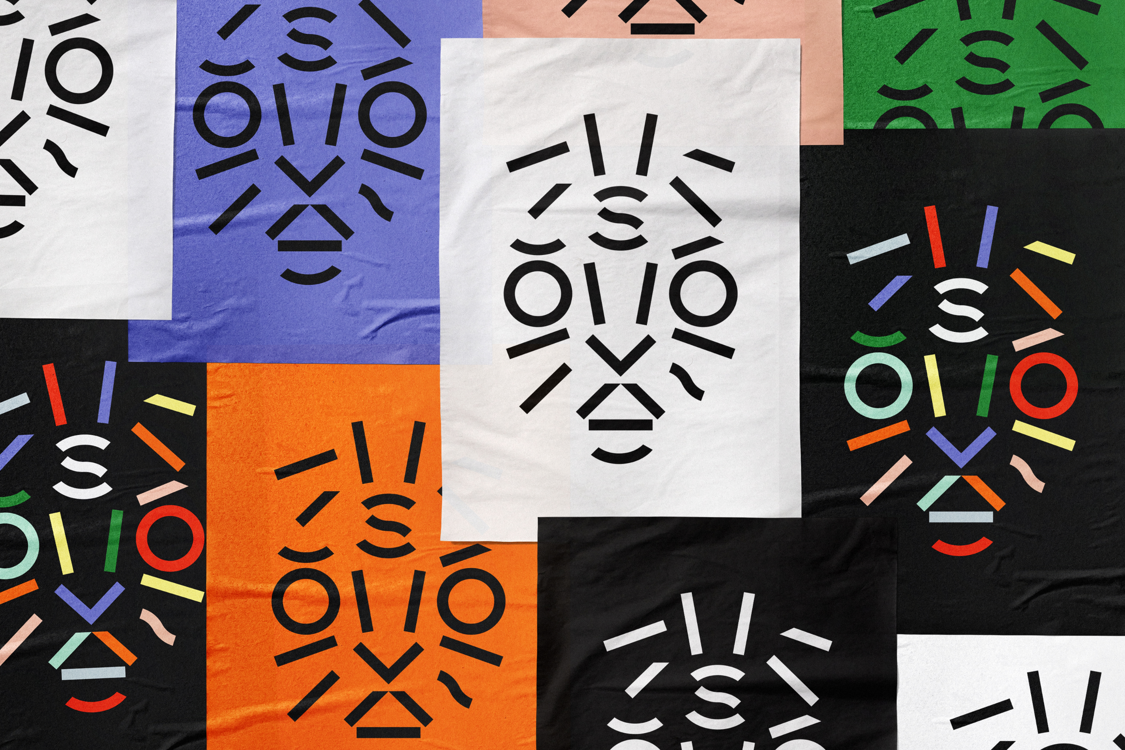
- Using letter parts as graphic elements.
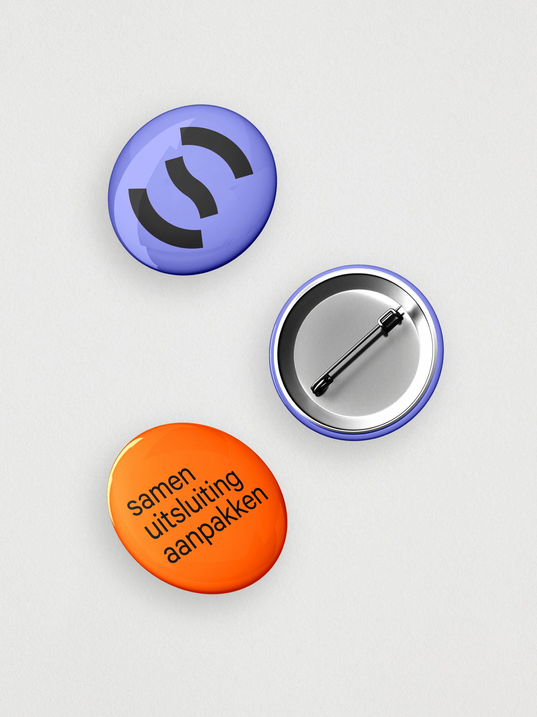
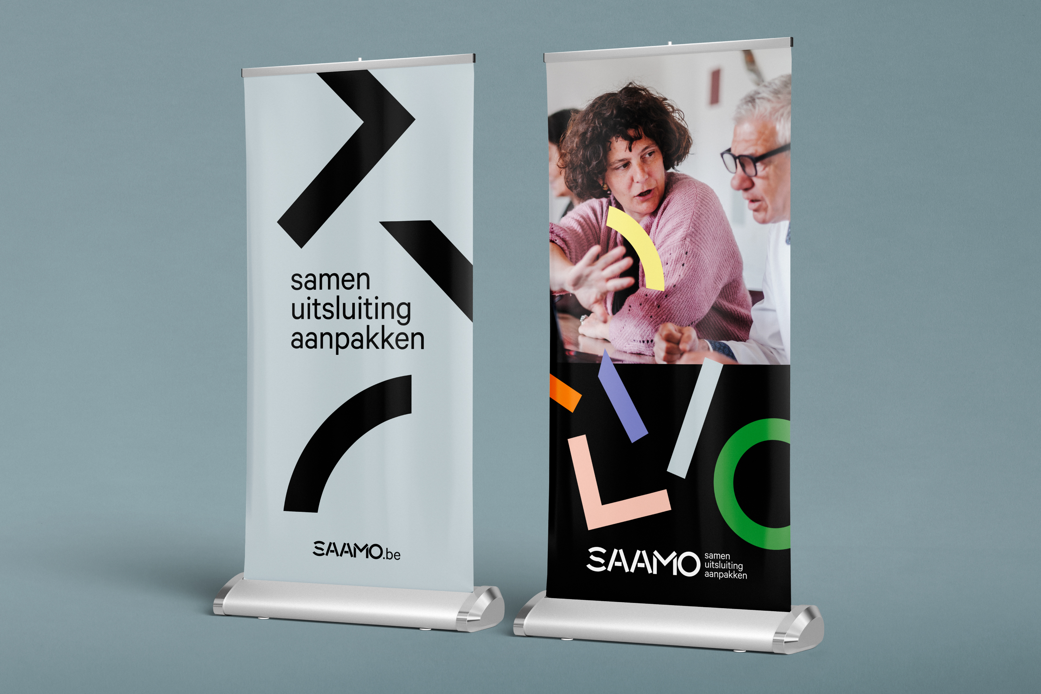
- With a warrior comes warpaint. With these marks SAAMO members transform into warriors.
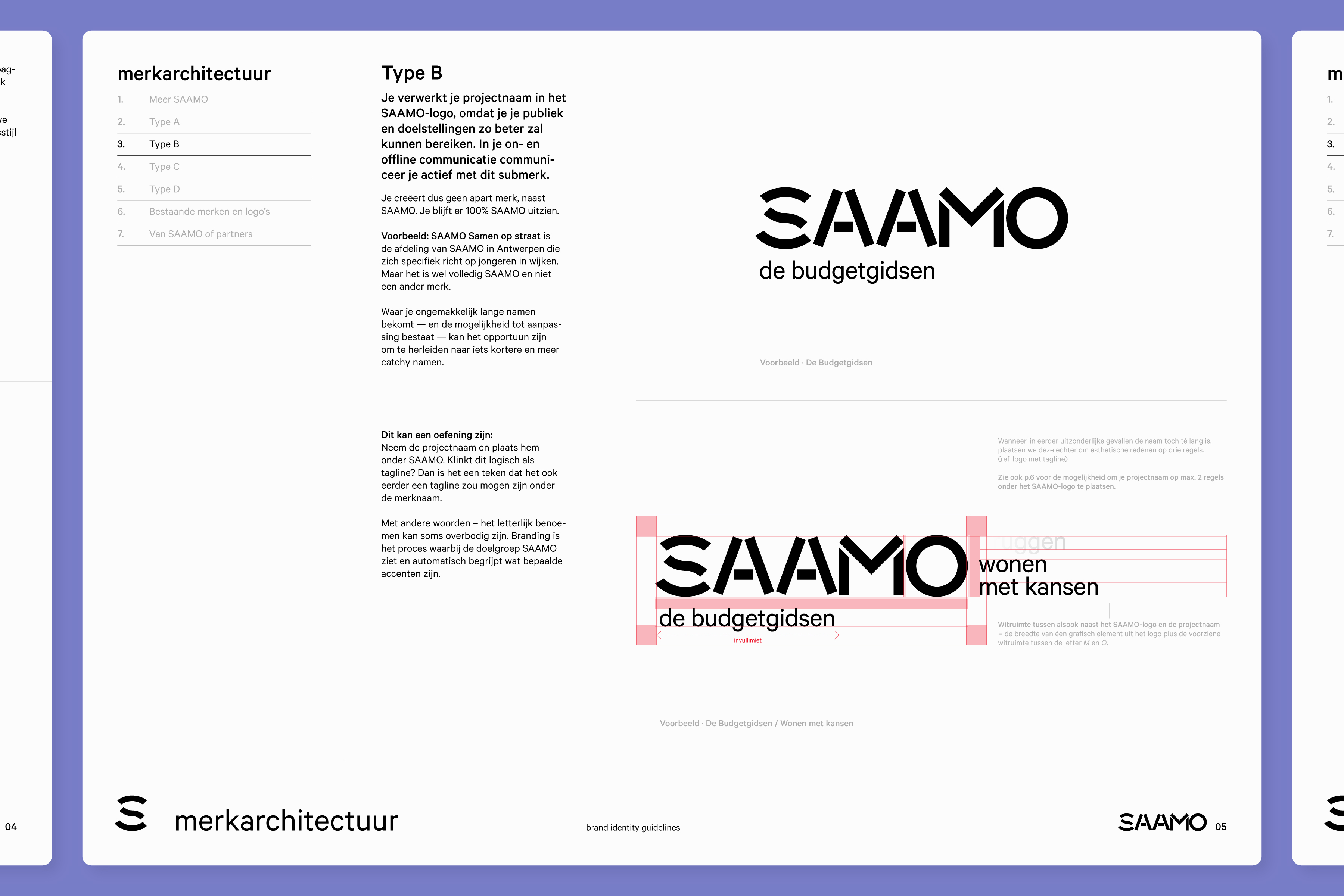
During the past decades, new SAAMO projects had often turned into brands of their own. Leaving their portfolio cluttered with over one hundred sub-brands, to the detriment of their overarching identity. To combat this, we created a simplified system and educated the client on the importance of recognizability, showing them that many project brands made more sense as baselines.
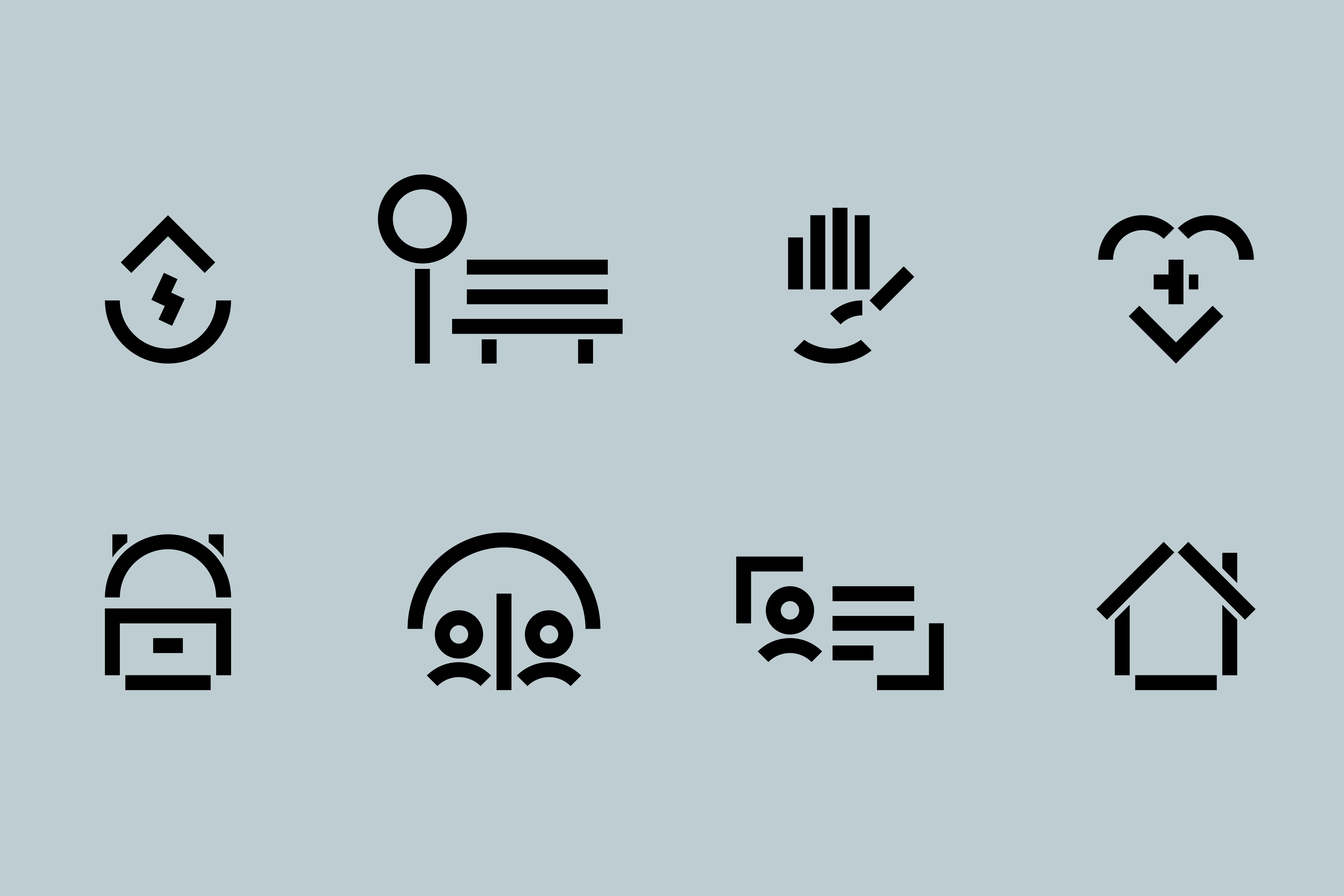
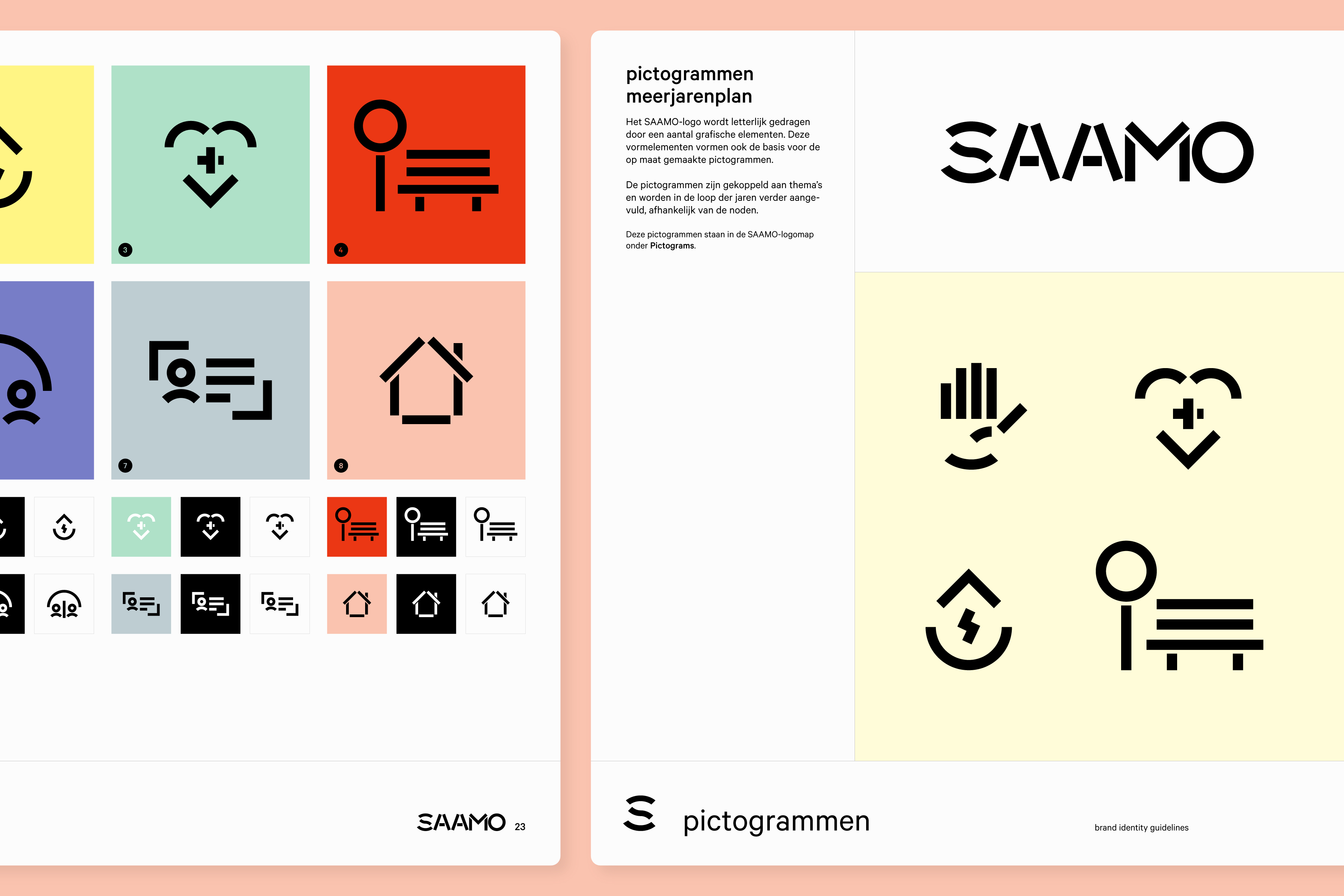
Built with parts from the wordmark and color palette, these visual icons prove helpful in brochures and in the community centers.


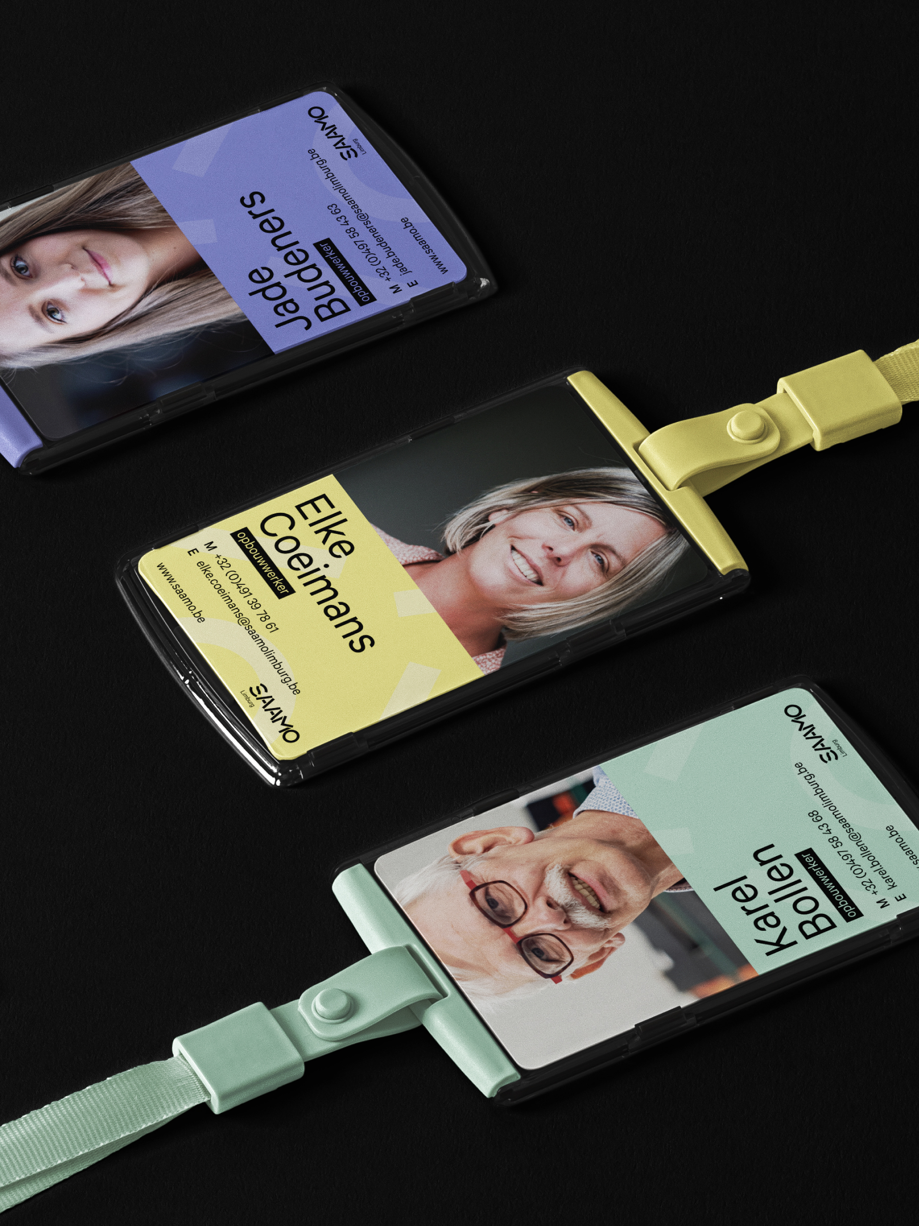
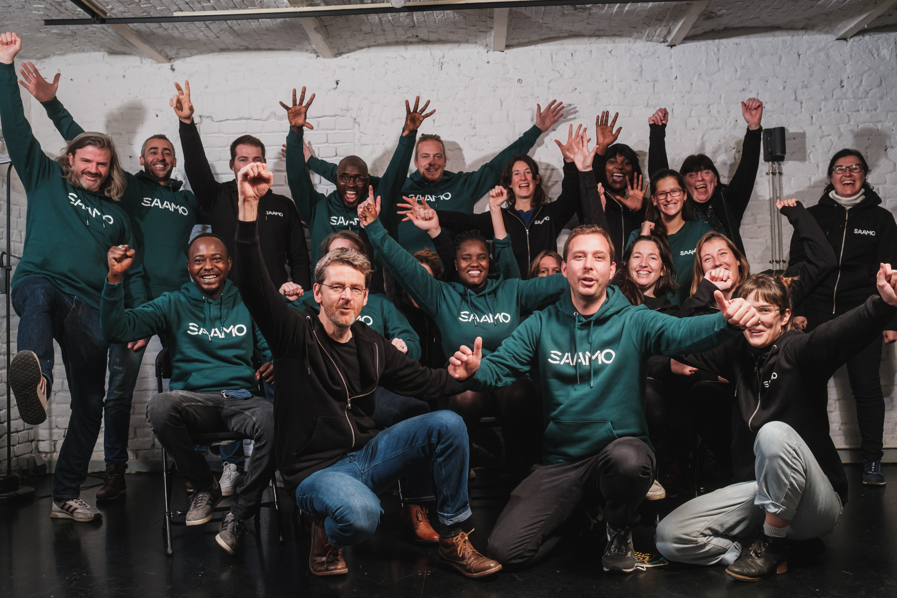
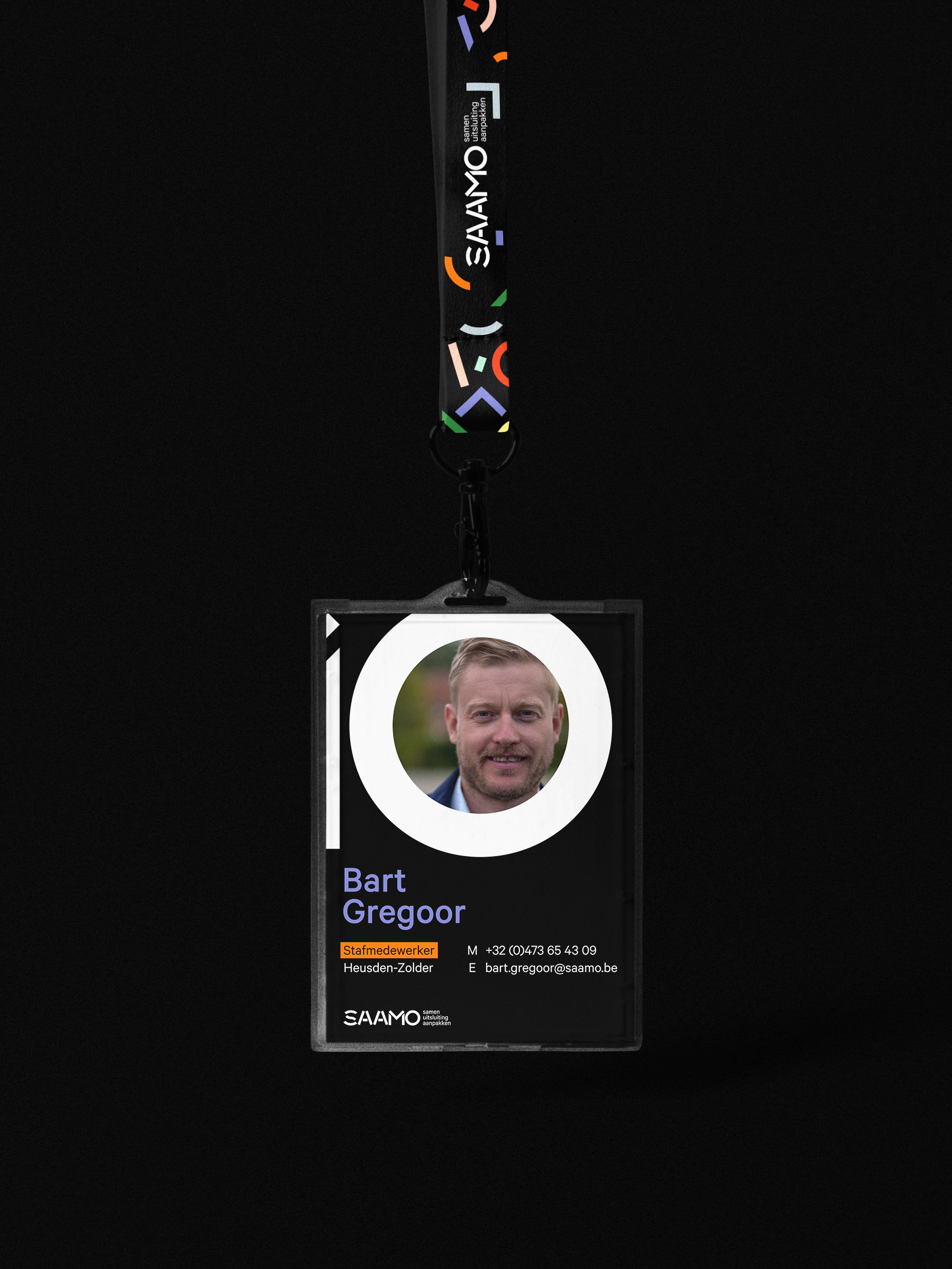
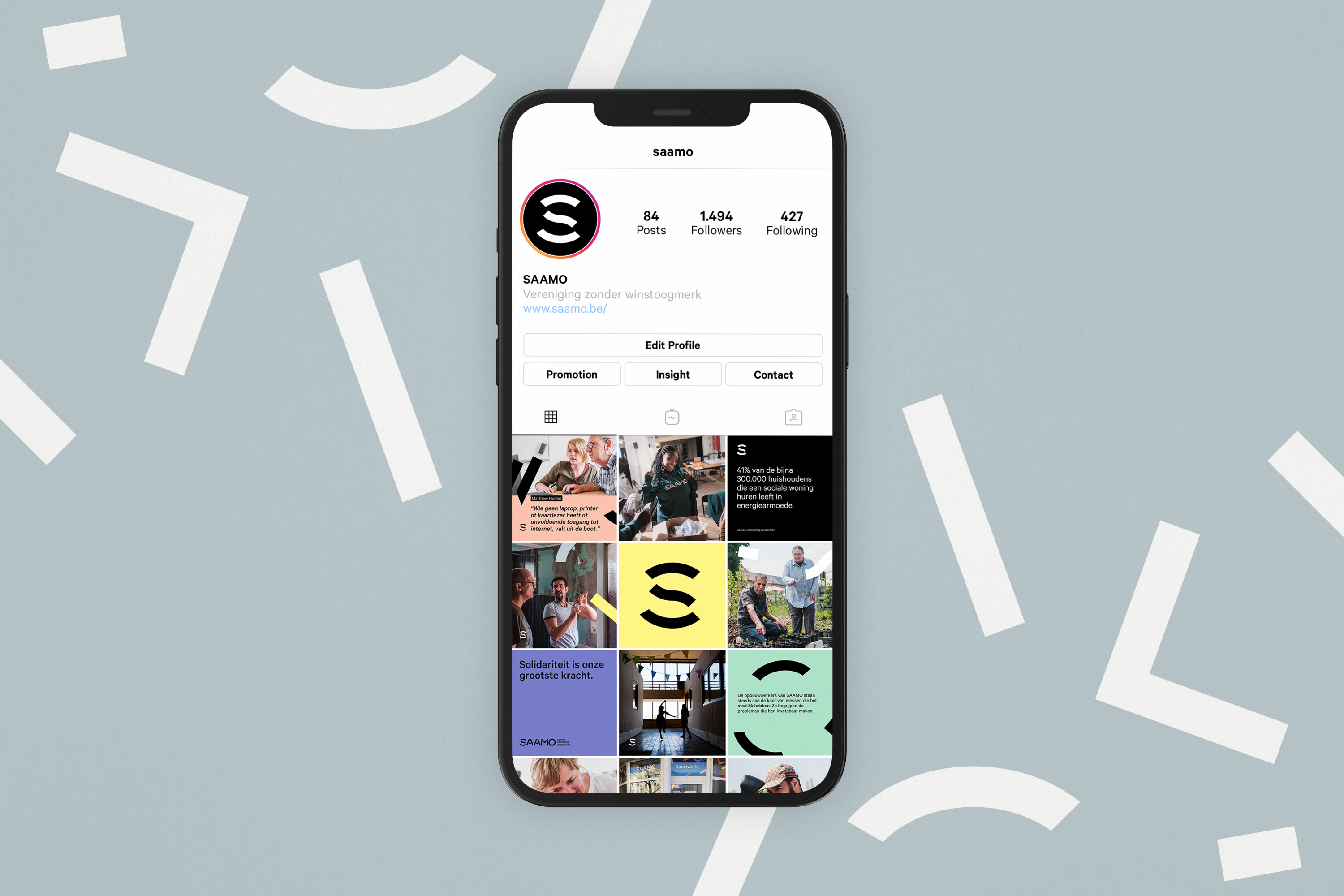
SAAMO’s development workers go into their communities every day to make a difference. They wear the brand with love and pride. Easily recognizable by those who need them most.