Smile Safari
EN Smile Safari is, so to speak, at the forefront of ‘social media and smartphone tourism’. As such, they offer a captivating experience along several — sometimes ludic — decors in which visitors can take their most social media-worthy photos and videos. Yet it can’t all be sunshine and rainbows: as a growing company, they ran into several specific issues. They had no clear visual system, leading to their growing base of employees to start freestyling with whatever was available.

The client was clear and adamant: the old logo stays. Nevertheless I worked on two optional redesigns, and guess what: they changed their mind!

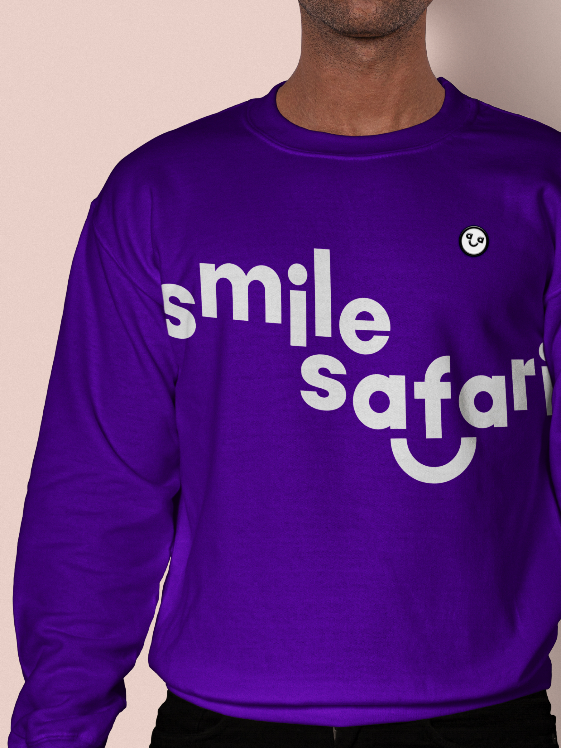
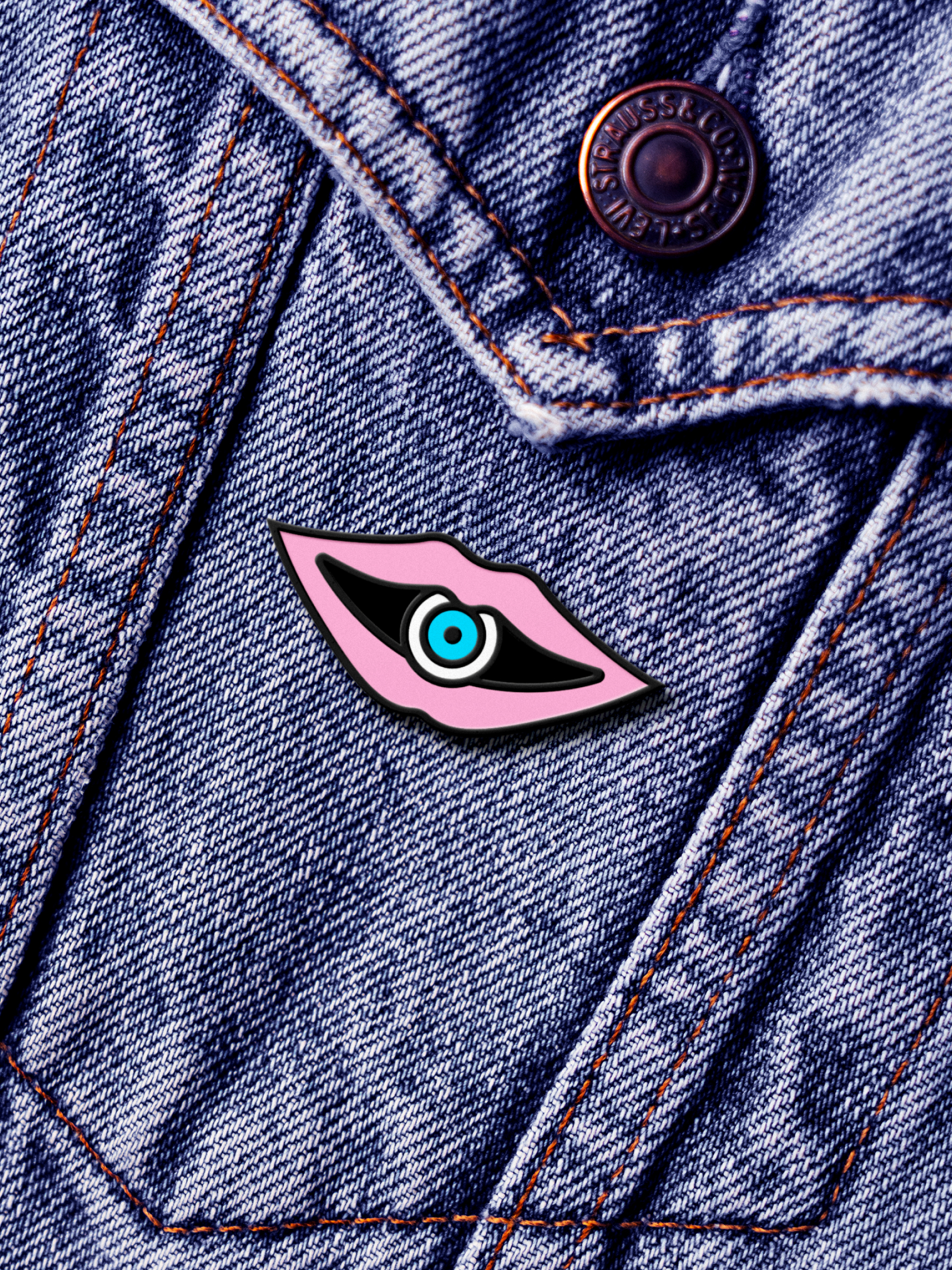
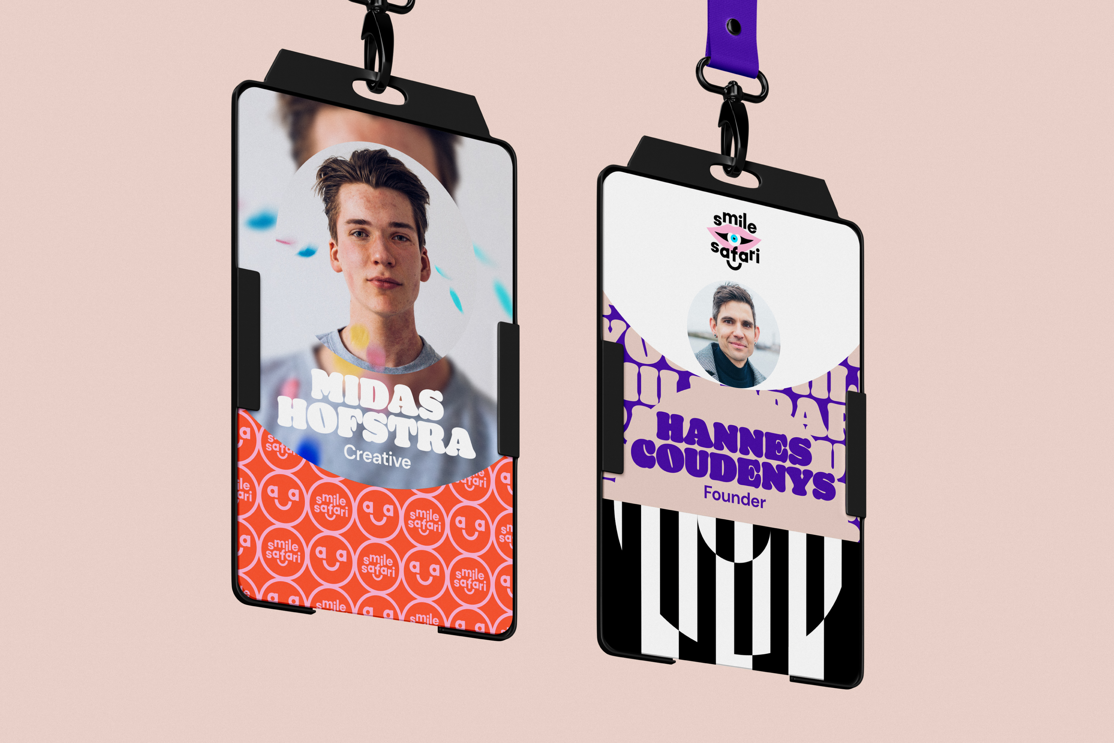
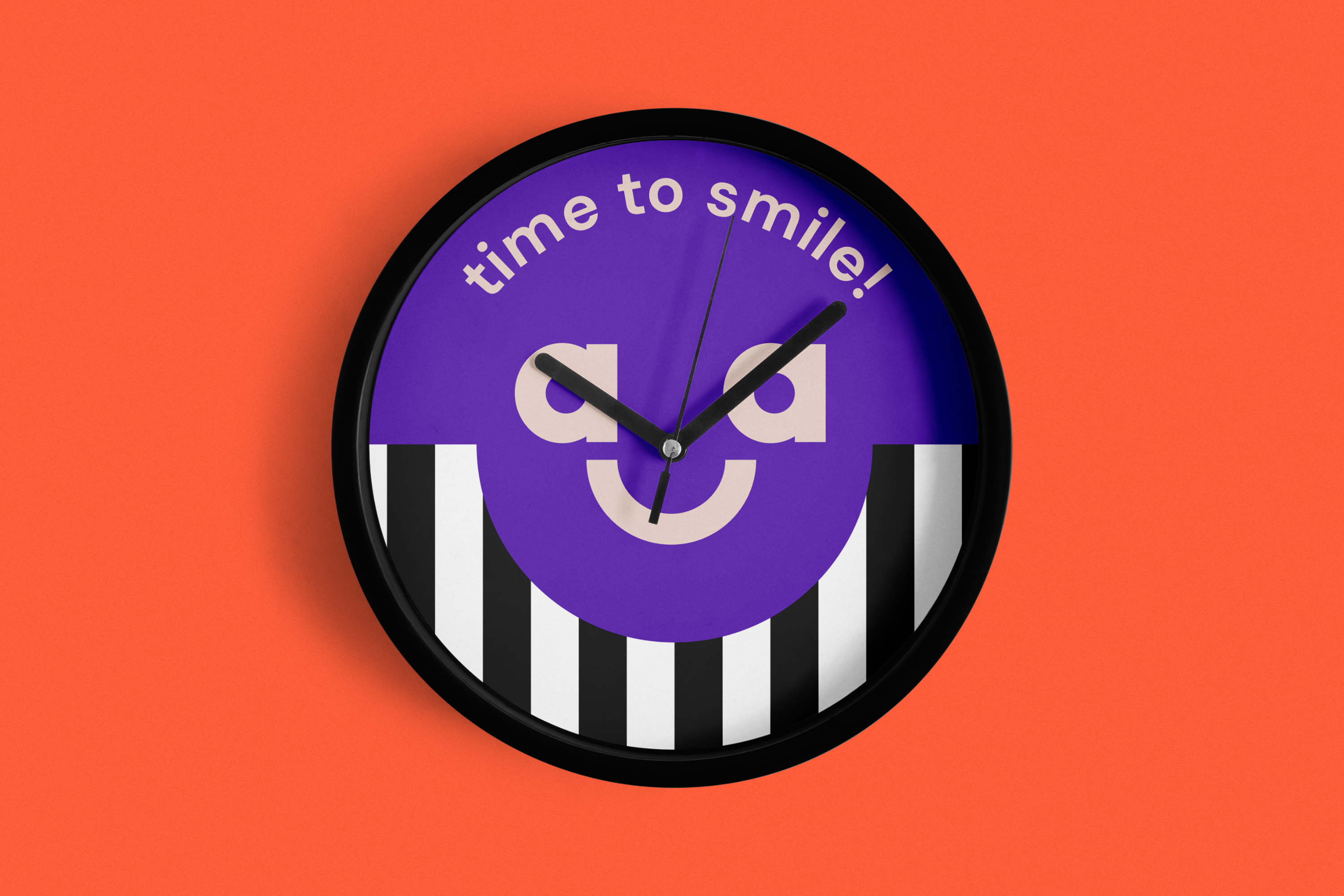
The people at Smile Safari were fond of the mouth, smile and eyes. However, the former logo didn’t always work on different scales and formats. As a solution to that, the elements were incorporated as a typographic treatment into the wordmark.


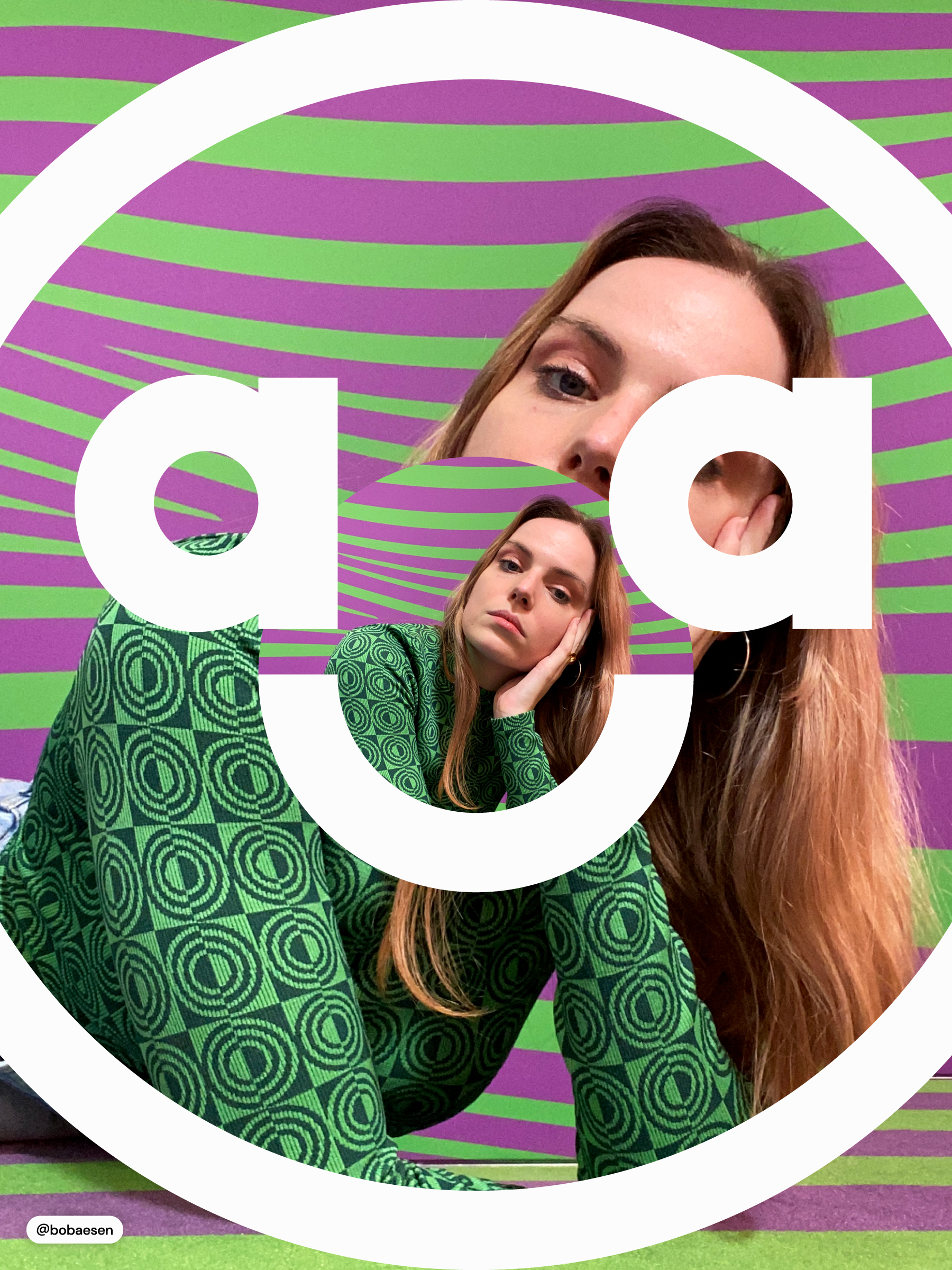
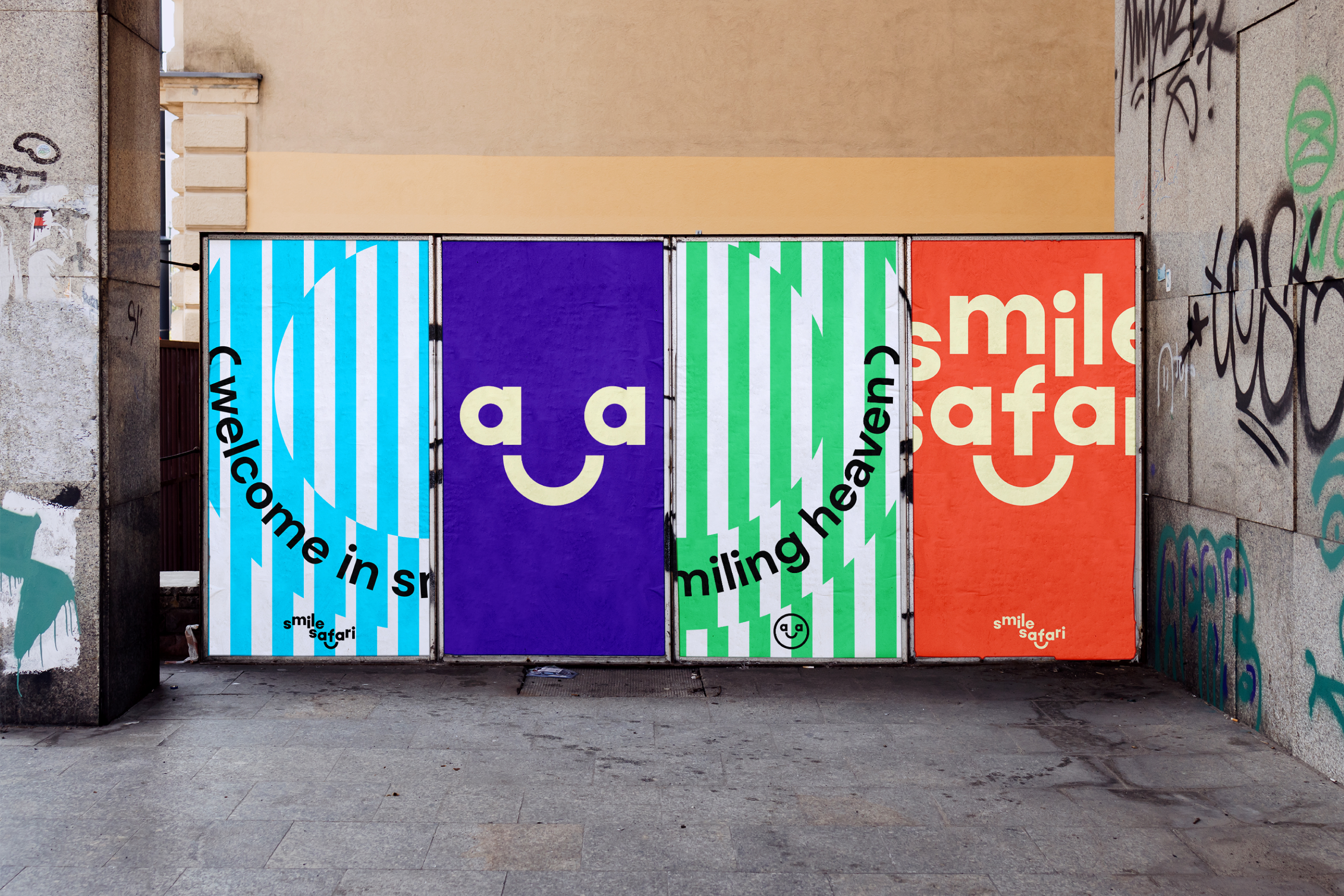
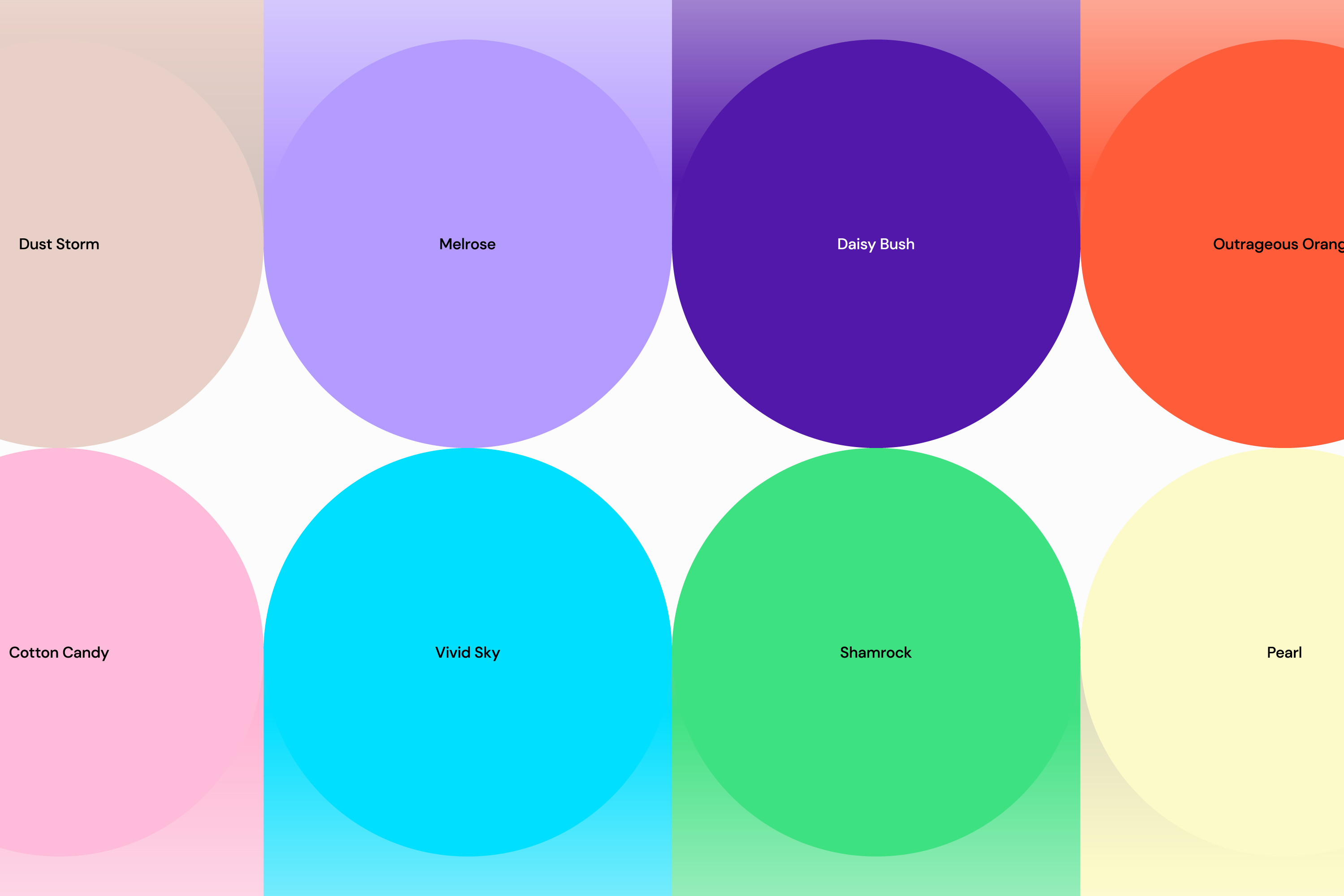
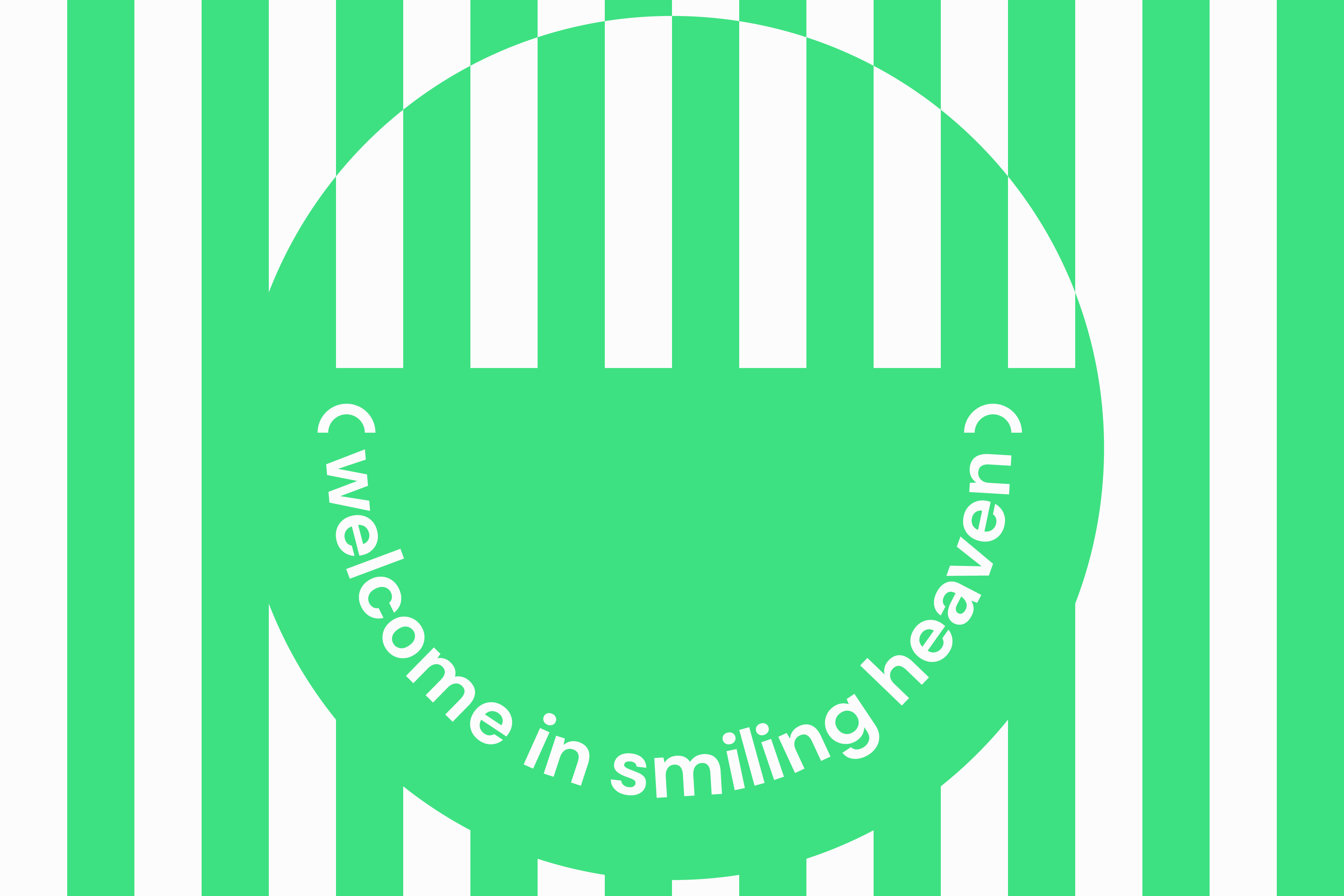
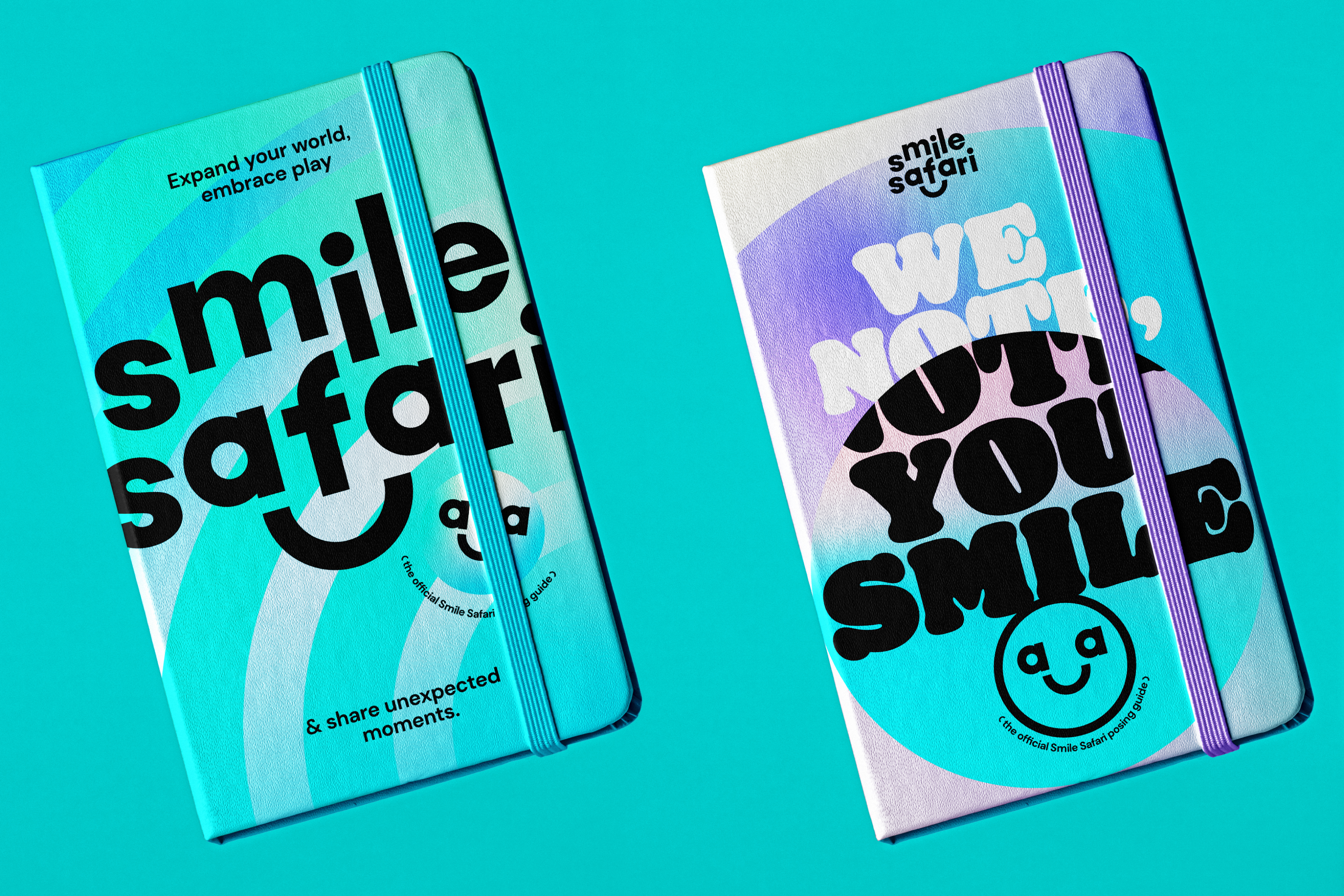
Smile Safari is a — or perhaps thé most — colorful place. So they needed color! Cuz it’s time to smile. A thoughtfully selected palette conveys the vibrancy of Smile Safari. On top of that, three typefaces were chosen that work in unison to emphasize the spectacle that is Smile Safari. Oh, and patterns please!


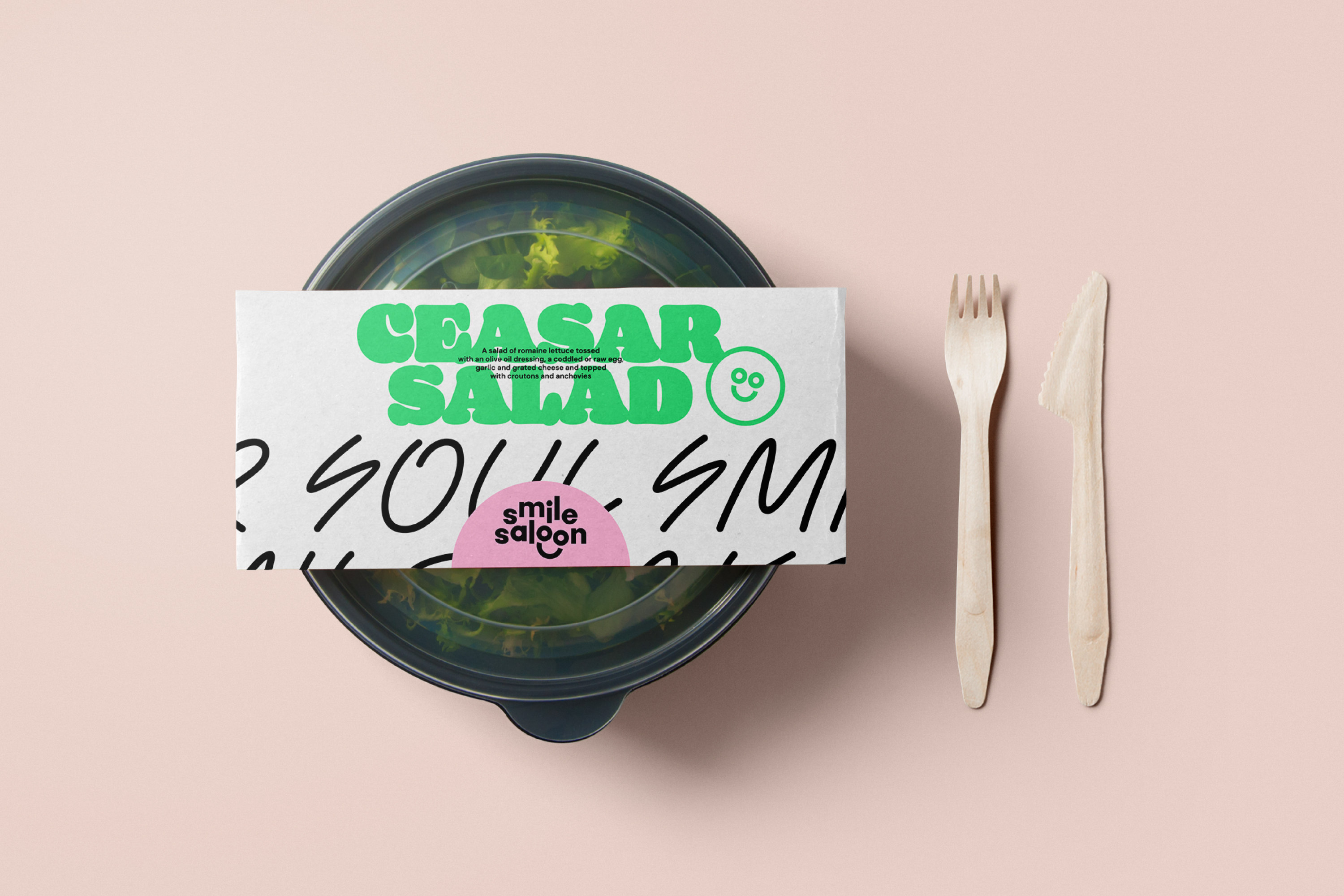
A sub-brand was created for their own snackbar named